If only monetary policy in 2008 had been what it was in 2020.

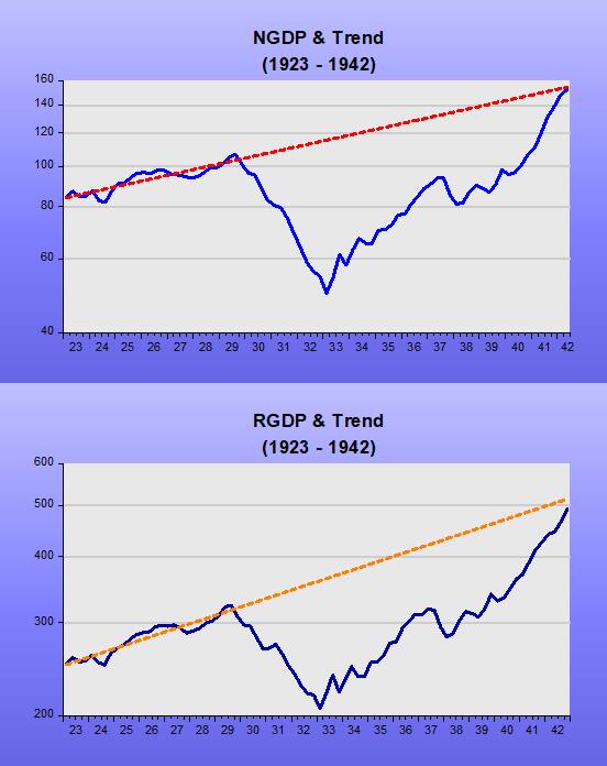
Many like to compare the Covid19 contraction with the Great Depression. In addition to the nature of the two contractions being completely unrelated, while in the first two months of the Covid19 crisis (from the February peak to the April trough) RGDP dropped 15%, it took one year from the start of the Great Depression for RGDP to drop by that amount.

Although the Covid19 shock has also no common element with the Great Recession, a comparison between the two is instructive from the monetary policy point of view. This is so because the Great Recession was the “desired outcome” of the Fed´s monetary policy. Bear with me and I´ll try to convince you that is not a preposterous statement.

Motivated by the belief that the 2008-09 recession originated with the losses imposed on banks by their exposure to real estate loans and propagated through a consequent breakdown in the ability of banks to get loans to credit-worthy borrowers, government, the Fed and regulators intervened massively in credit markets to spur lending.

Bernanke´s January 13, 2009 speech “The crisis and the policy response” summarizes that view:

“To stimulate aggregate demand in the current environment, the Federal Reserve must focus its policies on reducing those spreads and improving the functioning of private credit markets more generally.”

Bernanke´s “credit view” of the monetary transmission process is well established. Two articles support that view.

His flagship 1983 article is titled “Non-Monetary Effects of the Financial Crisis in the Propagation of the Great Depression.”

“…we focus on non-monetary (primarily credit-related) aspects of the financial sector–output link and consider the problems of debtors as well as those of the banking system. We argue that the financial disruptions of 1930-33 reduced the efficiency of the credit allocation process; and that the resulting higher cost and reduced availability of credit acted to depress aggregate demand.

His 1988 primer “Monetary Policy Transmission: Through Money or Credit?

“…The alternative approach emphasizes that in the process of creating money, banks extend credit (make loans) as well, and their willingness to do so has its own effects on aggregate spending.”

For details on the Fed´s credit market interventions (with the purpose of reducing spreads, which to the Fed is a sign of credit market dysfunction), see chapter 15 of Robert Hetzel´s “The Great Recession

“The answer given here is that policy makers misdiagnosed the cause of the recession. The fact that lending declined despite massive government intervention into credit markets indicated that the decline in bank lending arose not as a cause but as a response to the recession, which produced both a decline in the demand for loans and an increase in the riskiness of lending.

In their effort to stimulate the economy, policy makers would have been better served by maintaining significant growth in money as an instrument for maintaining growth in the dollar expenditures [NGDP growth] of the public rather than on reviving financial intermediation

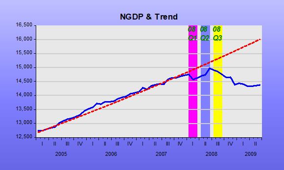
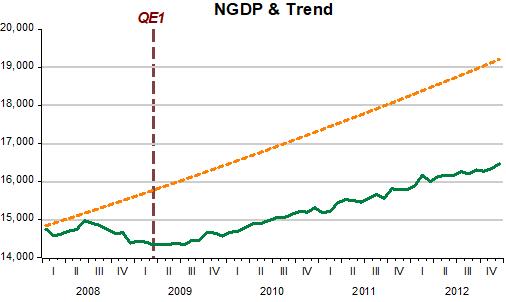
The charts below attest to that fact insofar as spreads began to fall, the dollar exchange rate began to depreciate and the stock market began to rise, only after the Fed implemented quantitative easing (QE1) in March 2009.

The purchase of treasuries by the Fed was what “saved the day”, not the array of credit policies that had been implemented for several months prior. Note, however, that the monetary policy sail was only at half-mast. On October 2008, the Fed had introduced IOER (interest on reserves), so that the rise in the monetary base from all the Fed´s credit policy would not “spillover” into an increase in the money supply. (The rise in the reserve/deposit (R/D) ratio in fact more than offset the rise in the base, so money supply growth was negative).

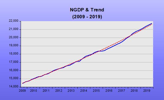
What QE did was to increase the velocity of circulation. With that, spending (NGDP) growth stopped falling and then began to rise slowly. As the next chart shows, the Fed (due to inflation worries) never allowed NGDP growth to make-up for the previous drop, “calibrating” monetary policy to keep NGDP growth on a lower trend path and lower growth rate.

Skipping to 2020, when the Covid19 shock hit, NGDP tanked. With spreads rising, the Fed again, now under Jay Powell (who must have learned “creditism” from his time with Bernanke), quickly announced a large batch of programs to intervene in credit markets to sustain financial intermediation.

While in the U.S., it was all about “closing spreads”, in Europe the sentiment was the opposite:

Christine Lagarde (March 12): “We are not here to close spreads”

Laurence Meyer (March 17): “The Fed is here to close spreads”

In “Covid19 and the Fed´s Credit Policy”, Robert Hetzel writes:

“…When financial markets actually did continue to function, Chairman Powell claimed that it was because of the announcement effect that the programs would become operational in the future…”.

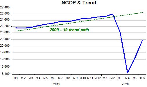
Looking at the charts for the period, we again observe that spreads fell (markets functioned) when monetary policy – through open market operations, with the Fed buying treasury securities – becomes expansionary. The difference, this time, is that the monetary policy sail was at “full mast”, so that money supply growth rose fast.

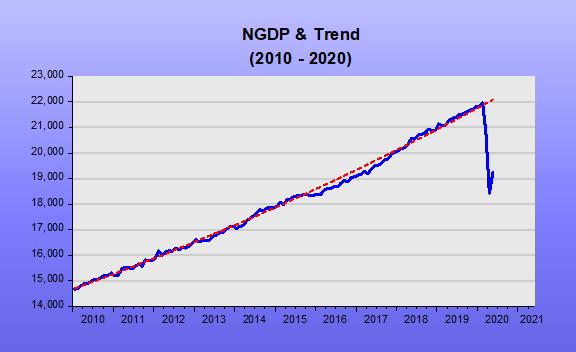
Compared to the post 2008-09 period, NGDP reversed direction in a V-shape fashion (data on monthly NGDP to June from Macroeconomic Advisers). This time around, it seems the Fed is set in making-up for the lost spending, returning NGDP to the trend level that prevailed from 2009 to 2019.

Going forward, once the economy fully reopens the Fed will have to make clear that monetary policy will the conducted to maintain nominal stability (i.e. NGDP cruising along the trend level path it was on previously). Given the degree of fiscal “overkill” that has been practiced, the Fed will have to resist pressures to maintain an overly expansionary monetary policy to relieve fiscal stress through inflationary finance.

The workings of the monetary ‘thermostat’ during the Great Depression

George Selgin is writing a series on “The New Deal and Recovery”. In the Intro (where you find links to the five ‘chapters’ written so far), he summarizes:

“I believe that the New Deal failed to bring recovery because, although some New Deal undertakings did serve to revive aggregate spending, others had the opposite effect, and still others prevented the growth in spending that did take place from doing all it might have to revive employment.”

I want to show in this post the monetary policies that resulted from all the “actions” or policy decisions taken during the 1929-1941 period. The details of those decisions are the subject of Selgin´s series. As he points out:

I´m not opposed to countercyclical economic policies, provided they serve to keep aggregate spending stable, or to revive it when it collapses.”

In short, that statement is all about the workings of the thermostat. To recap, Friedman´s thermostat analogy as an explanation for the Great Moderation says:

“In essence, the newfound stability was the result of the Fed (and many other Central Banks) stabilizing nominal expenditures. In that case, from the QTM, according to which MV=PYthe Fed managed to offset changes in V with changes in M, keeping nominal expenditures, PY, reasonably stable.

The two charts below summarize the behavior of aggregate nominal spending (NGDP) and the associated real aggregate output that resulted during the four “stages” of the Great Depression

If anything, 1929 shows what happens when the thermostat brakes down. When velocity drops (money demand rises) deep and fast, if instead of offsetting that move in velocity money supply tanks, aggregate nominal spending collapses, and so does real output.

The next chart reveals what happened during 1929 and early 1933, the first “stage” of the GD.

In the next Chart, we observe the power of monetary policy. With the thermostat set to “heat-up” the economy (with money supply growth reinforcing the rise in velocity, the opposite of what happened in 1929-33). Going off gold in March 1933 played a major role.

Going into Stage III we see a “reversal of fortune”, with monetary policy quickly tightening (culprits here are the gold sterilization policy by the Treasury & increase in required reserves by the Fed). In “The New Deal and Recovery Part IV – The FDR Fed, George Selgin writes:

“…instead of taking steps to ramp-up the money stock, Fed officials became increasingly worried about…inflation! Noticing that banks had been storing-up excess reserves, they feared that a revival of bank lending might lead to excessive money growth, and therefore refrained from contributing directly to that growth. Then, finding a merely passive stance inadequate, they joined forces with the Treasury to offset gold inflows. These steps were among several that contributed to the “Roosevelt Recession” of 1937-8…”

Stage IV coincides with the end of gold sterilization and ensuing expansionary monetary policy.  The military spending that began in 1940 to bolster the defense effort gave the nation’s economy an additional boost. This worked through the rise in velocity while money growth remained stable.

How did the price level behave through the different stages? The next chart gives the details. Stage I witnessed a big drop in prices (deflation). In Stage II the process stopped and reversed somewhat. Stage III indicates why the Fed worried about inflation and in Stage IV we see the effect on prices of the “defense effort”. Even so, by the end of 1941, the price level was still significantly below the July 1929 level!

After Covid19, inflation?

Recently, manifestations about rising inflation following the Covid19 have increased substantially. Two recent examples illustrate, with both appealing to the QTM:

  1. The quantity theory of money today provides – as it always has done – a theoretical framework which relates trends in money growth to changes in inflation and nominal GDP over the medium and long term.

A condition for the return of inflation to current target levels is that the rate of money growth is reduced back towards annual rates of increase of about 6 per cent or less.

2. The quantity theory of money, the view that the money supply is the key determinant of inflation, is dead, or today’s mainstream  tell us. The Federal Reserve is now engaged in a policy that will either put the nail in the quantity theory’s coffin or restore it to the textbooks. Sadly, if the theory is alive and wins out, the economy is in for a very rough ride.

All those that appeal to the QTM to argue, “Inflation is coming”, forget that in 1971 Milton Friedman published in the JPE “A monetary theory of nominal income”, in which he argued for using the quantity theory to derive a theory of nominal income rather than a theory of either prices or real income.

There he asks; “What, on this view will cause the rate of change in nominal income to depart from its permanent level [or trend level path]? Anything that produces a discrepancy between the nominal quantity of money demanded and the quantity supplied, or between the two rates of change of money demanded and money supplied.”

A little over two decades later, in 2003, Friedman popularized that view with his “The Fed´s Thermostat” to explain the “Great Moderation”:

“In essence, the newfound stability was the result of the Fed (and many other Central Banks) stabilizing nominal expenditures. In that case, from the QTM, according to which MV=PY, the Fed managed to offset changes in V with changes in M, keeping nominal expenditures, PY, reasonably stable. Note that PY or its growth rate (p+y), contemplates both inflation and real output growth, so that stabilizing nominal expenditures along a level growth path means stabilizing both inflation and output.

How does that square with the evidence? To illustrate we look at two periods, the “Great Inflation” of the 70s and the “Great Moderation” (1987 – 2005).

During the “Great Inflation”, it seems the Thermostat broke down and the “temperature” kept rising above “normal”. During the “Great Moderation”, it appears the Thermostat worked just fine, keeping the “temperature” close to normal levels at all times.

How does the stability of the trend level path for nominal spending (NGDP) translate to the growth rate view? In the next charts, we observe that during the “Great Inflation” the “temperature” oscillated on a rising trend, while during the “Great Moderation” it was much more stable with no trend.

If the Thermostat is working fine, according to Friedman stabilizing nominal expenditures along a level growth path means stabilizing both inflation and output.

The next charts show that is the observed outcome.

On average, real growth is similar in both periods, while the volatility (standard deviation) of growth is 50% (1.3 vs 2.6) lower.

Note that price & wage controls work like putting a wet cloth on the patient´s forehead to reduce fever, as doctors did in the Middle Ages! As soon as you take away the wet cloth, temperature rises.

An interesting takeaway gleaned from the results following the application of Friedman´s Fed Thermostat, is that the 70s was no “stagflationary decade” as pop culture has it. It was just the “inflationary decade”.

It also shows that comments as the one below are plainly wrong:

“We are right to fear inflation. The 1970s was a colossal disaster and economists still can’t even agree on what exactly went wrong.”

Having understood the meaning and usefulness of “Friedman´s Thermostat”, we can use it to explain what happened after Bernanke took over as Chair in January 2006.

“Dialing down” the economy

AS the chart shows, when Bernanke began his tenure as Fed Chair, initially he kept nominal spending (NGDP) evolving close to the trend level path. Around mid-2007, he began to worry about the potential inflationary effects of low unemployment (4.4%, below their estimate of the natural rate) and rising oil prices.

At that point, money demand was on a rising trend (falling velocity) due to the uncertainties flowing from the financial sector problems that were brewing (remember the “start date” of the financial crisis was August 07 when two funds from Paribas were closed for redemption) and money supply growth was “timid”. As a result, nominal spending began to fall below trend.

In mid-08, the FOMC became very concerned about inflation. After all, in the 12 months to June 08 oil prices doubled. Bernanke´s summary of that meeting discussions is unequivocal evidence that the Fed´s goal was to “dial down” the Thermostat (or “cool”) the economy!

FOMC Meeting June 2008 (page 97):

“My bottom line is that I think the tail risks on the growth and financial side have moderated. I do think, however, that they remain significant. We cannot ignore them. I’m also becoming concerned about the inflation side, and I think our rhetoric, our statement, and our body language at this point need to reflect that concern. We need to begin to prepare ourselves to respond through policy to the inflation risk; but we need to pick our moment, and we cannot be halfhearted. When the time comes, we need to make that decision and move that way because a halfhearted approach is going to give us the worst of both worlds. It’s going to give us financial stress without any benefits on inflation. So we have a very difficult problem here, and we are going to have to work together cooperatively to achieve what we want to achieve.”

Before that meeting, the fall in nominal spending below trend was likely the result of unintended mistakes in the calibration of the thermostat, in the sense that the increase in money supply failed to fully offset the fall in velocity. During the second half of 2008, however, money supply growth decreased sharply, especially after the Fed introduced IOER in October. That certainly qualifies as “premeditated crime”!

The 2008-09 recession (dubbed “Great”) is more evidence for the relevance of the “Thermostat Framework” spelled out by Friedman. It was the conscious “dialing down” of the thermostat by the Fed, not the house price bust or the associated financial crisis, that caused the deep recession.

The charts below illustrate the impact of the “dialing down of the thermostat” by the Fed.

What comes next, however, puts the “Thermostat Analogy” in “all its glory”, in addition to dispelling the notion made popular by Carmen Reinhart and Kenneth Rogoff that this recovery was slow because it followed a financial crisis.

In short, once the economy was “cooled”, the Fed never intended to “warm it up” to the previous trend level path, keeping the thermostat working fine for the lower temperature the Fed desired.

The implications of a well-functioning thermostat are evident in the charts below.

1 Nominal spending is kept stable along a (lower) level path

2 Both real output and inflation are stabilized (also at a lower rate)

The next chart (which makes use monthly NGDP from Macroeconomic Advisers) shows what happened following the Covid19 “attack”.

This is not like 2008. This time around, the Fed had no hand in the outcome. The virus came out of left field and “crunched” both the supply and demand “armies”, leading to a sudden “drop shock” in nominal spending.

Money demand jumped (velocity tanked). The next chart shows that the Fed reacted in the right way, with a lag, given the surprise attack.

The economy faces a health issue with mammoth economic consequences. The thermostat dialed the temperature down “automatically” and will likely maintain the “cooler temperature” while the virus is “active”. All the Fed can do is work to ensure the temperature does not fall even more. Given the latest data available (May), it appears the Fed is managing to “hold the fort”.

What the inflacionistas worry is with the aftermath, after the virus loses relevance. They argue the massive rise in the money supply observed so far ensures an inflation boom in the future.

As the thermostat analogy indicates, you have to take into account the behavior of velocity (money demand). So far, even with the “Federal Reserve pouring money into the economy at the fastest rate in the past 200 years”, what we observe is disinflation!

How will the Fed behave once the virus loses relevance? Will it set the thermostat at the previous temperature (previous trend level path)? In other words, will it make-up for the losses in nominal spending incurred during the pandemic, or not?

In this post, David Beckworth argues that there is no evidence the Fed plans to undertake a make-up policy, concluding:

“So wherever one looks, make-up policy is not being forecasted. Its absence does not bode well for the recovery and underscores the urgency of the FOMC review of its framework. I really dread repeating the slow recovery of the last decade. So please FOMC, bring this review to a vote and give make-up policy a chance during this crisis.”

After the Great Recession, the Fed chose not to “make-up”. The chart illustrates

What will it be this time around?

If the Fed undertakes a make-up policy, inflation will temporarily rise (just as it temporarily fell when the thermostat was dialed down). The impossible dream I have is that the Fed not only makes up for the virus-induced loss, but also partly for the loss incurred by its misguided policy of 2008!

As always, the inflation obsession will the greatest barrier the Fed will face. No wonder more than 40 years ago James Meade warned that inflation targeting was “dangerous”.

PS Update to the last chart above with data to August 20. The “bad outcome” seems to be transpiring!

Toying with business cycle dating

In this year´s ASSA Annual Meeting in January, Christina & David Romer (R&R) presented “NBER Business Cycle Dating: Retrospect and Prospect”:

“…Our most substantial proposal is that the NBER continue this evolution by modifying its definition of a recession to emphasize increases in economic slack [Deviations from potential output and/or unemployment] rather than declines in economic activity…”

“…Throughout the paper, we make use of Hamilton´s (1989) Markov switching model as a framework for investigating and assessing the NBER dates. Though judgement will surely never be (and should not be) eliminated from the NBER business cycle dating process, it is useful to see what standard statistical analysis suggests and can contribute.”

On page 32, they move to Application: The implications of a two-regime model using slack for dating US business cycle since 1949:

“We have argued that a two-regime model provides insights into short-run fluctuations. And we have argued for potentially refining the definition of a recession to emphasize large and rapid increases in economic slack rather than declines in economic activity. Here, we combine the two approaches by applying Hamilton´s two-regime model to estimates of slack and exploring the implications for the dating of postwar recessions.”

According to R&R (page 34):

“The largest disagreement between the two regimes estimates using slack and the NBER occurs at the start of the Great Recession. The NBER identifies both 2008Q1 and 2008Q2 as part of the recession (with the peak occurring in 2007Q4), while our estimates (see table 1) put the probability of recession as just 21% in 2008Q1 and 43% in 2008Q2.”

Table 1 Economic Performance going into the Great Recession

Quarter NBER Date

In Recession?

Agreement of 2-Regime Model Shortfall of GDP from Potential Unemployment minus Nat Rate
2007Q4 No 97% -0.6% 0.6%
2008Q1 Yes 21% 4.2% 0.9%
2008Q2 Yes 43% -0.2% 1.4%
2008Q3 Yes 91% 3.9% 2.7%

It is somewhat confusing! The 2-Regime model only “fully” agrees with the NBER that the economy was in a recession from 200Q3. The GDP gap roams all over the place, while the unemployment gap is increasing consistently over time.

Although R&R suggest the NBER emphasize measures of slack, those measures are very imprecise. This is clear given the CBO systematic revisions of potential output in the chart below.

Since I´m “toying” with dates, I´ll try using the NGDP Level target yardstick to see what it says about the Great Recession. (Useful recent primers on Nominal GDP Level Targeting are David Beckworth and Steve Ambler).

In the years preceding the Great Recession, there were many things happening. There was the oil shock that began in 2004 and gathered force in subsequent years. There was the bursting of the house price bubble that peaked in mid-2006 and, from early 2007, the problems with the financial system began, first affecting mortgage finance houses but soon extending to banks, culminating in the Lehmann fiasco ofSeptember 2008.

The next chart  the oil and house price shocks.

The predictable effect of an oil (or supply) shock is to reduce the real growth rate and increase inflation (at least that of the headline variety). The charts indicate that was what happened.

The chart below shows that when real growth fell due to the supply shock, real output (RGDP) dropped below the long-term trend (“potential”?). Does this mean the economy is in a recession? If that were true, the recession would have begun in 2006!

In that situation, how should monetary policy behave? Bernanke was quite aware of this problem. Ten years before, for example, Bernanke et al published Systematic Monetary Policy and the Effects of Oil Price Shocks”. (1997)

In the conclusion, they state:

“Substantively, our results suggest that an important part of the effect of oil price shocks on the economy results not from the change in oil prices, per se, but from the resulting tightening of monetary policy. This finding may help to explain the apparently large effects of oil price changes found by Hamilton and many others.”

In the chart below, we observe that during his first two years as Chair, Bernanke seems to have “listened to himself” because NGDP remained very close to the target level path all the way through the end of 2007.

With NGDP kept on target, the effects of the supply shock are “optimized”. Headline inflation, as we saw previously will rise, but if there is little or no change in NGDP growth, core measures of inflation will remain contained.

During the first quarter of 2008, NGDP was somewhat constrained. This likely reflects the FOMC´s worries with inflation. RGDP growth dropped further, but during the second quarter of 2008, the Fed seemed to be trying to get NGDP back to trend. RGDP growth responded as expected and core inflation remained subdued.

At that point, June 2008, it appears Bernanke reverted to focus almost singly on inflation, maybe remembering what he had written 81/2 years before in What Happens when Greenspan is gone? (Jan 2000):

“U .S. monetary policy has been remarkably successful during Alan Greenspan’s 121/2 years as Federal Reserve chairman. But although President Clinton yesterday reappointed the 73-year-old Mr. Greenspan to a new term ending in 2004, the chairman will not be around forever. To ensure that monetary policy stays on track after Mr. Greenspan, the Fed should be thinking through its approach to monetary policy now. The Fed needs an approach that consolidates the gains of the Greenspan years and ensures that those successful policies will continue; even if future Fed chairmen are less skillful or less committed to price stability than Mr. Greenspan has been.

We think the best bet lies in a framework known as inflation targeting, which has been employed with great success in recent years by most of the world’s biggest economies, except for Japan. Inflation targeting is a monetary-policy framework that commits the central bank to a forward-looking pursuit of low inflation; the source of the Fed’s current great performance; but also promotes a more open and accountable policy-making process. More transparency and accountability would help keep the Fed on track, and a more open Fed would be good for financial markets and more consistent with our democratic political system.”

This is evident in his summary of the FOMC Meeting June 2008 (page 97), where Bernanke says:

“My bottom line is that I think the tail risks on the growth and financial side have moderated. I do think, however, that they remain significant. We cannot ignore them. I’m also becoming concerned about the inflation side, and I think our rhetoric, our statement, and our body language at this point need to reflect that concern. We need to begin to prepare ourselves to respond through policy to the inflation risk; but we need to pick our moment, and we cannot be halfhearted. When the time comes, we need to make that decision and move that way because a halfhearted approach is going to give us the worst of both worlds. It’s going to give us financial stress without any benefits on inflation. So we have a very difficult problem here, and we are going to have to work together cooperatively to achieve what we want to achieve.”

From that point on, things derailed and a recession becomes clear in the data. It appears the NGDP Level Targeting framework agrees with Hamilton´s 2-regime model that the recession was a fixture of 2008Q3.

If NGDP had not begun to tank in 2008Q3, a recession might, later, have been called before 2008Q3, but it would never have been dubbed “Great”, more likely being short & shallow.

The takeaway, I believe, is that the usual blames placed on the bursting of the house price bubble, which led to the GFC and then to the GR is misplaced. Central banks love that narrative because it makes them the “guys who saved the day” (avoided another GD) when, in fact, they were the main culprits!

PS: The “guiltless” Fed is not a new thing. Back in 1937, John Williams (no relation to the New York Fed namesake), Chief-Economist of the Fed, Board Member and professor at Harvard (so unimpeachable qualifications, said about the 1937 downturn:

If action is taken now it will be rationalized that, in the event of recovery, the action was what was needed and the System was the cause of the downturn. It makes a bad record and confused thinking. I am convinced that the thing is primarily non-monetary and I would like to see it through on that ground. There is no good reason now for a major depression and that being the case there is a good chance of a non-monetary program working out and I would rather not muddy the record with action that might be misinterpreted.

The usefulness of underlying, or core, rates

It is the case, instead, of not missing the trees for the forest. The case for core inflation, for example, is well established, but not always understood. The charts below show that sometimes the qualitative information given by “trees & forests” or core and headline rates is the same, but at other times, “trees & forests” look very different.  In 2007-08, the Fed took drastic and wrong actions because it only looked at the “forest” and missed the “health of the trees”.

The next chart shows the effect of the “sudden drop shock” brought on by Covid19. With economic activity “dumped”, temporary lay-offs skyrocketed.

Temporary lay-offs have since decreased, bringing headline unemployment down. Should we be “thrilled” by the falling headline unemployment, or are we missing the more durable effects of the wild swings in temporary lay-offs? In effect, these lay-offs may increase again following the pick-up in infections since the last data collection period for the employment report.

In order to have a better understanding of what´s happening to the trend in unemployment, we have to strip-out this highly (and distorting) volatile element. Our measure of core unemployment includes those called marginally attached (which are not in the labor force but want to work) and excludes those defined as on temporary lay-offs. In practice, it defines core unemployment by subtracting temporary lay-offs from the U-5 definition of unemployment.

The chart below shows that for most of the time, headline & core unemployment gave out the same information about unemployment.

Since the Covid19 “sudden drop shock”, however, they diverge “majestically”.

The underlying or core unemployment trend trend reversed direction in July. Hopefully this reversal will be confirmed with the data for August.

Contrasting Inflation Targeting with NGDP Level Targeting

Given the recent increase in the number of articles or blog posts on NGDP level targeting (see, for example, here, here, here or here), I thought it would be useful to post an essay I wrote at the end of 2014 that compared NGDP-LT to inflation targeting. The piece is empirical, but I think the visual evidence is compelling,

Which is more reliable-1

Recession & Recovery: Is a rebound likely?

From March 12, 2009

Recently there was a heated debate involving, on one side Greg Mankiw and, on the other, Krugman and Brad DeLong. The spat revolved around the CEA deficit projection based on the prediction of relatively fast growth down the road. According to the CEA: “A key fact is that recessions are followed by rebounds. Indeed, if periods of lower-than-normal growth were not followed by periods of higher-than-normal growth, the unemployment rate would never return to normal”.

Implicitly, the CEA (and DeLong and Krugman) is supposing that “trend” (or “potential”) GDP and “normal” (or “natural”) unemployment are constant and that fluctuations in output (and employment) represent temporary deviations from “trend”.

Figure illustrates the concept.

What Mankiw is saying is that the “trend” itself may change. If, for example, the “trend” falls as a consequence of the recession we should not observe a strong rebound in the future exactly because “potential” GDP has fallen.

Based on his constant “trend” view of the process, Krugman asks: “How can you fail to acknowledge that there´s huge slack capacity in the economy right now? And yes, we can expect fast growth if and when that capacity comes back in to use”. The “slack capacity” is given by the distance between the level of “potential” GDP and actual GDP.

DeLong illustrates the argument for a strong rebound following a recession by showing (figure 2) that “those post recession periods of falling unemployment are also times of rapid output growth”. But figure 3 shows that if we remove points from the 1981-83 period, the positive correlation between higher unemployment and future growth disappears!

Maybe there´s something “special” about the 1981-82 recession? To find out I describe three alternative views of “potential” output and compare two periods; 1979-84 and 2002-08.

Figure 4 describes “potential” output according to the CBO estimate, figure 5 measures “potential” by applying the Hodrick-Prescott Filter (H-P) to the real GDP series and figure 6 calculates “potential” from a regression of real GDP on real consumption of non durables and services.

This last measure is based on work by John Cochrane (1994), who suggested that consumption might be useful to track movements in “trend” GDP. The idea behind this measure of “trend” or “potential” is based on the Friedman´s Permanent Income Hypothesis (PIH) coupled with Rational Expectations, according to which consumption primarily reflects the expectation of private households about long-term movements in income (GDP). Therefore, consumption should provide a reasonably good measure of “trend” GDP.

In the pictures, the yellow shaded areas designate periods when the economy was in recession. The dotted green lines on figure 6 indicate moments when “trend” growth appears to have changed.

What is notable is that in figures 4 and 5 “potential” GDP is much smoother (“linear”) than in figure 6. Note that in figures 4 and 5, for example, “potential” GDP doesn´t budge at the time of the second (and significant) oil shock in 1979-80. Intuition and theory are more consistent with the observation on figure 6 that shows that “potential” GDP falls temporarily.

The 1981-82 recession was severe. From peak to trough, GDP fell by almost 3% and unemployment reached almost 11%. From figure 6, however, we see that even before the recession was officially over “potential” GDP increased so that when the economy picked up the “distance” between “potential” GDP and actual GDP had increased even more, giving rise to a robust rebound.

Figure 6 indicates that “potential” or “trend” GDP does not evolve at a constant rate. During the 1981-82 recession, important structural changes were taking place. At that time Volker succeeded in controlling inflation (with gains in credibility) and Reagan convinced economic agents that economic policy (redirected towards “smaller” government) changed favorably “perceptions of the future”[1].  These changes increased “potential” GDP, which had the effect of increasing actual GDP growth. Therefore, the strong rebound in GDP growth was not the consequence of a high rate of unemployment, but was more likely due to the structural changes that increased the level of “potential” GDP. This is consistent with the finding that if we ignore those points in figure 2 the positive correlation between unemployment and future growth disappears.

Another marked difference between figures 4 & 5 on the one hand and figure 6 on the other, is that in the latter we observe one break in “potential” GDP in early 2007 (when the first signs of the subprime crisis showed up) and a reversal of “trend” in mid 2008. Apparently, the “intermediation shock” and the policy reactions to it this time around worsened agents “perceptions of the future”, reducing “potential” GDP and increasing the “natural” or “normal” rate of unemployment (here also, the behavior of the stock market may be regarded as a ”blanket” indicator, with the S&P showing a decrease of around 30% since election day)[2].

An article in the NYT (March 7) argues in favor of some kind of structural change: “… The acceleration [of unemployment] has convinced some economist that, far from an ordinary downturn after which jobs will return, the contraction under way reflects a fundamental restructuring of the American economy. In crucial industries – particularly manufacturing, financial services and retail – many companies have opted to abandon whole areas of business…”

According to figure 6, at the moment the level of GDP is just at “potential” meaning, opposite to what Krugman argues, that there is no “slack” – large or small – in the economy as indicated by, for example, figure 4. In this situation a strong rebound, underlying the CEA predictions, is quite unlikely!


PS June 25, 2020

What I didn´t fully grasp at that time was the importance of monetary policy in ‘determining’ the level of the trend growth path.

With the Fed laser-focused on inflation, something confirmed by Bernanke himself in the June 08 FOMC meeting:

“My bottom line is that I think the tail risks on the growth and financial side have moderated. I do think, however, that they remain significant. We cannot ignore them. I’m also becoming concerned about the inflation side, and I think our rhetoric, our statement, and our body language at this point need to reflect that concern. We need to begin to prepare ourselves to respond through policy to the inflation risk; but we need to pick our moment, and we cannot be halfhearted.”

“Agents perceptions of the future were worsened”, with the economy evolving along a ‘depressed growth path’.

The danger at present is that the Fed will fall short in ‘reviving’ agents perceptions of the future, in which case a rebound will be incomplete and the economy will remain in an even deeper depressed mode!

[1] The behavior of the stock market corroborates this observation. After spending the previous 17 years fluctuating around 850 points, in mid 1982 the Dow (and S&P) begin a long boom period that would take the Dow from 850 points to 12 thousand points 17 years later!

[2] Otherwise the qualitative information given by the 3 pictures don´t differ. Notable is the fact that in the more recent period (something that is in fact observable since 1984) the economy evolves very close to “potential”. This has been named “The Great Moderation”.

The Longest Expansion: A post mortem

According to the NBER´s Business Cycle Dating Committee (BCDC), the expansion that began in June 2009 ended in February 2020, having lasted 128 months, eight months more than the March 1991 – March 2001 expansion.

A comparative analysis of these two long expansions should be useful. I´ll fudge the dates of the 1991 – 2001 expansion, extending it to the end of the next cycle that began in November 2001 and ran through December 2007. The only reason behind this extension is to bring out the importance of a stable level path of NGDP. [Note: The 2001 recession was more like a growth retrenchment, with year-on-year real growth never turning negative. Also, the popular rule of thumb of negative real growth in two successive quarters never materialized].

What separated these two long expansions was the deep and longest post war recession that went on from December 2007 to June 2009 (18 months), being known as the Great Recession.

The main statistics (average over periods) for the two expansions is illustrated below:

The charts are telling. In order to have all the data on a monthly basis, for RGDP & NGDP I use the monthly estimates of those variables (available from January 1992) provided by Macroeconomic Advisers.

The first panel illustrates the behavior of NGDP & RGDP relative to the Great Moderation trend level path.

During the first expansion, both NGDP & RGDP hug close to the trend for much of the time. During 1998-03, there is some instability in NGDP, which is mirrored in RGDP instability. Note that towards the end of the first expansion, although NGDP remains close to trend, RGDP falls significantly below trend. What is going on?

In the second expansion, both NGDP & RGDP remain on a stable level trend path that has been permanently lowered! Later I will examine the ‘transition’ from the high to the low trend path brought about by the Great Recession.

The next panel shows the behavior of prices, both the headline and core versions of the PCE during the two expansions.

During the first expansion, both headline & core prices remained close to the 2% trend line from 1992. Towards the end of this expansion, just as RGDP fell below trend, headline PCE rises above trend. The fall in RGDP growth & rise in inflation implied by those moves is consistent with predictions of the dynamic AS/AD model in the case of a supply (oil price in this case) shock.

During the second expansion, after 2014, when oil prices dropped significantly, headline PCE shifted down and never “recovered”. Core PCE has remained significantly below the 2% trend and has risen at a rate below 2%.

The real and nominal output growth panel (and the price panel) indicate the two expansion phases were characterized by nominal stability. The differing characteristic is that during the recent long expansion, nominal stability followed a lower trend level path with lower growth.

To see how the economy transited from the “high” to the “low” path, I examine the details of the last years of the first expansion.

Those years were marked by oil shocks. As the dynamic AS/AD model tells us, growth slows and inflation rises. The best monetary policy can do in those instances is to keep aggregate nominal spending (NGDP) growth stable along the level trend path.

As the next charts indicate, the results are ‘model consistent’. An oil shock happened:

As predicted by the model, RGDP dropped below trend (real growth fell) and headline PCE shifted up (headline inflation increased):

NGDP, however, remained close to the trend level path, while Core PCE remained below the 2% level path, with core inflation remaining subdued:

The fall in real growth and the rise in headline inflation were the unavoidable consequence of the oil shock. Apparently, both Greenspan during his last year as Fed Chairman and Bernanke during his first two years as Chairman recognized this fact, keeping monetary policy on an ‘even keel’ (evolving close to the trend level path).

After that point, things unraveled. In the first six months of 2008, oil prices climbed an additional 44%. Headline PCE (and inflation) followed suit.

It is rare that a policymaker has the chance of putting his academic knowledge into practice. In 1997, Bernanke, with co-authors Gertler & Watson, published a paper titled:

“Systematic Monetary Policy and the Effects of Oil Price Shocks”. 

In the conclusion, they state:

“Substantively, our results suggest that an important part of the effect of oil price shocks on the economy results not from the change in oil prices, per se, but from the resulting tightening of monetary policy. This finding may help to explain the apparently large effects of oil price changes found by Hamilton and many others.”

At that point, June 2008, monetary policy was “crunched”, with NGDP growth turning negative! No wonder the “effects of the oil price changes became large”, and the recession became “Great”.

The problem, I believe, is that Bernanke´s mind became increasingly focused on inflation. In that same year (1997) he had published a paper (coauthored with Frederick Mishkin) titled:

Inflation Targeting: A New Framework for Monetary Policy?

At that time he was still “flexible”, concluding that IT “construed as a framework for making monetary policy, rather than rigid rule, has a number of advantages…”

It seems “rigidity” set in because eleven years later, concluding the June 2008 FOMC Meeting, Bernanke states:

 “My bottom line is that I think the tail risks on the growth and financial side have moderated. I do think, however, that they remain significant. We cannot ignore them. I’m also becoming concerned about the inflation side, and I think our rhetoric, our statement, and our body language at this point need to reflect that concern. We need to begin to prepare ourselves to respond through policy to the inflation risk; but we need to pick our moment, and we cannot be halfhearted.”

Bernanke´s timing could not be worse because at that point, June 2008, a recovery appeared to be incipient. The rest, as they say, is history. The economy never recovered so the “longest expansion” should never be hailed or become a paradigm.

Appendix:

As the charts below indicate, the US economy has always recovered from deep recessions, even from the “Great Depression”. By recovery, I mean that the economy climbs back to where it should have been if not for the recession/depression. As the bottom right chart indicates, the economy never recovered from the Great Recession.

A big problem is that monetary Policy is “guided” by unobservable variables. The concept of “potential” output, for example, says that if real output is above “potential”, monetary policy should be tightened, because otherwise inflation will rise. Conversely, if real output is below “potential”, monetary policy should be loosened, otherwise inflation will fall.

The fact is that when guided by unobservable variables, monetary policy becomes a “matching game”.

The charts below indicate that when actual output is above the initial estimate of “potential”, “potential” output is systematically revised up until it “matches” actual output. The opposite happens when actual output is below initial estimates of “potential”. Note that in the first case, inflation, instead of rising was falling and remained low thereafter, while in the second case it remained low throughout.

This imparts a tightening bias to monetary policy. In the “longest expansion”, this bias proved “mortal”.

PS: Note that I make no mention of the house price bust or financial troubles, usually pinned as “causes” of the Great Recession. I believe those were minor actors in the “movie”. The “movie was a box-office bust” because monetary policy, the “leading actor”, forgot its lines!

Getting down to business

A James Alexander, Benjamin Cole, Justin Irving, Marcus Nunes post

After a six-year run, during which Historinhas helped spread the Market Monetarist approach, this blog will undergo a metamorphosis, becoming NGDP-Advisers. The blog will continue but be augmented by new products that will be available via subscription.”.

In watching the U.S. and global economy since 2008 (and before) it has become obvious there is a dearth of financial advice that is informed by Market Monetarism, or even close attention to nominal gross domestic product (NGDP).

A recent Economist magazine study of the International Monetary Fund’s national economic forecasts from 1999 to 2014 found, “Over the period, there were 220 instances in which an economy grew in one year before shrinking in the next.  In its April forecasts the IMF never once foresaw the contraction looming in the next year.” Not once! Something is wrong in economic forecasting.

NGDP-watching is not a forecasting cure-all. However, Historinhas and the Market Monetarists have time and again been proven right on macroeconomic matters when the establishment was wrong. When old-school monetarists feared hyperinflation from unconventional easing measures, Market Monetarists correctly saw the real risk was still tight money. When Keynesians predicted recession from cuts in government spending during the 2013 US fiscal cliff episode, Market Monetarists anticipated the monetary offset and were proven right. When central banks in Europe raised interest rates in 2011, Market Monetarists called this for the debacle that it became.

It is time to bring these insights from the world of blogging, into the realm of macro forecasting, time to unseat the hopeless “experts”.

The bedrock of our approach is a healthy fear of market efficiency, though our approach still has important advice for investors. Many have missed historic bond rallies since 2008, so certain were established advisers that an inflationary surge, or even hyperinflation, was pending. Equity investing is equally tricky.

Central bank monetary policy sometimes feels like a game of blackjack, random. Time and again in its history, the Fed has tried to tighten (in recent years), or loosen (in earlier eras), yet been beaten back when markets question their view of economic reality. It is hard to forecast how stubborn a central bank will be in such situations and when it will inevitably buckle, but our approach frames the issues correctly, allowing all investors to understand where their risk lies.

At NGDP Advisers, we hope not only to continue our examination of the global economy, but also to recognize realities and advise accordingly. We’ll yell from the cliff tops ‘what should be’, but we’ll also help you get ready for what ‘will be’.

Please join us at ngdp-advisers.com, the best is yet to come. The Historinhas blog will stay up but dormant, and recent and all future posts will be freely available here ngdp-advisers.com/blog/