Irony alert: The Fed has been doing AIT for three decades!

As I will show, it has also been doing NGDP-LT, albeit with a “variable” Level Trend. It´s amazing that it took them one and a half years to come up with a framework that had been in place for so long!

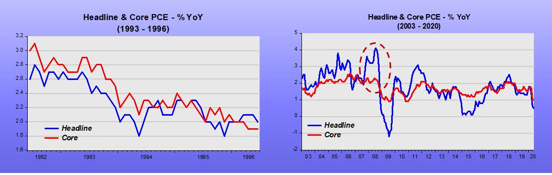
The chart below shows that the core PCE has closely followed the trend (estimated from 1992 to 2005). The trend reflects a 1.8% average inflation, not the 2% average target, but close.

To illustrate the fact that the Fed has effectively been practicing AIT, I zoom in on two periods (outside the estimation interval) to show an instance of adjustment from above and one from below.

Even now, after the Covid19 shock, it is trying to “make-up”!

The “other Policy framework” the Fed has been “practicing” with for over three decades is NGDP Level Targeting.

The set of charts below show how NGDP has evolved along the same trend during different periods.

The following chart zooms in on 1998 – 2004 and shows that the Fed first was excessively expansionary (reacting to the Asia & Russia +LTCM crises) and then “overcorrecting” in 2001-02 before trying to put NGDP back on the level trend, which it did by 2004. Many have pointed out that the Fed was too expansionary in 2002-04, blaming it for stoking the house bubble and the subsequent financial crisis. However, the only way the Fed can “make-up” for a shortfall in the level of NGDP is for it to allow NGDP to grow above the trend rate for some time!

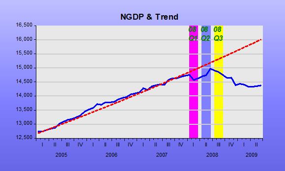
As the next to last chart shows, 2008 was a watershed on the Fed´s de facto NGDP-LT framework. As shown in the chart, in June 2008 the Fed “gave up” on the strategy, “deciding” it would be “healthier” for aggregate nominal spending (NGDP) to traverse to a lower level path and lower growth rate.

If you doubt that conjecture, read what Bernanke had to say when summarizing the June 2008 FOM Meeting.

Bernanke June 2008 FOMC Meeting:

“I’m also becoming concerned about the inflation side, and I think our rhetoric, our statement, and our body language at this point need to reflect that concern. We need to begin to prepare ourselves to respond through policy to the inflation risk; but we need to pick our moment, and we cannot be halfhearted.”

He certainly got what he wished for.  As the next chart indicates from the end of the Great Recession to just prior to the Covid19 shock, NGDP was spot on the new lower trend path alongside a reduced growth rate.

The Covid19 shock tanked NGDP. This was certainly different from what happened in 2008. Then, it was a monetary policy “choice”. Now, it was virus related. The other thing is that at present, instead of being worried about inflation being too high or risking getting out of control, the fear is with inflation being too low.

That worry, which has been evident for some time, led that Fed to unveil a new monetary policy framework, AIT, for average inflation targeting. As I argued before, this framework has been in place for decades!

The last chart above indicates that monetary policy is “trying” to make-up for the drop in NGDP from the “Great Recession Trend” it was on. We also saw that the Core PCE Index is on route to get back to its decades-long trend.

Given that inflation is a monetary phenomenon, these two facts are related. For inflation to go up (as required to get the price level back to the trend path) NGDP growth has to rise. However, many FOMC members are squeamish. We´ve heard some manifest that they would “be comfortable with inflation on the 2.25% – 2.5% range”.

The danger, given the presence of “squeamish” members, is there could come a time when the Fed would reduce NGDP growth before it reached the target path. Inflation would continue to rise (at a slower, “comfortable”, rate) and reach the price path while, at the same time, the economy remains stuck in an even deeper “depressive state” (that is, deeper than the one it has been since the Fed decided in 2008).

That is exactly what happened following the Great Recession. NGDP growth remained stable (at a lower rate than before) and remained “attached” to the lower level path the Fed put it on.

These facts show two things:

  1. To focus on inflation can do great damage to the economy. For example, imprisoning it in a “depressed state”.
  2. Since the Fed has kept NGDP growth stable for more than 30 years, and freely choosing the Level along which the stable growth would take place, the implication is that it has all the “technology” needed to make NGDP-LT the explicit (or just de facto) monetary policy framework. As observed, that framework is perfectly consistent with IT, AIT or PLT!

Toying with business cycle dating

In this year´s ASSA Annual Meeting in January, Christina & David Romer (R&R) presented “NBER Business Cycle Dating: Retrospect and Prospect”:

“…Our most substantial proposal is that the NBER continue this evolution by modifying its definition of a recession to emphasize increases in economic slack [Deviations from potential output and/or unemployment] rather than declines in economic activity…”

“…Throughout the paper, we make use of Hamilton´s (1989) Markov switching model as a framework for investigating and assessing the NBER dates. Though judgement will surely never be (and should not be) eliminated from the NBER business cycle dating process, it is useful to see what standard statistical analysis suggests and can contribute.”

On page 32, they move to Application: The implications of a two-regime model using slack for dating US business cycle since 1949:

“We have argued that a two-regime model provides insights into short-run fluctuations. And we have argued for potentially refining the definition of a recession to emphasize large and rapid increases in economic slack rather than declines in economic activity. Here, we combine the two approaches by applying Hamilton´s two-regime model to estimates of slack and exploring the implications for the dating of postwar recessions.”

According to R&R (page 34):

“The largest disagreement between the two regimes estimates using slack and the NBER occurs at the start of the Great Recession. The NBER identifies both 2008Q1 and 2008Q2 as part of the recession (with the peak occurring in 2007Q4), while our estimates (see table 1) put the probability of recession as just 21% in 2008Q1 and 43% in 2008Q2.”

Table 1 Economic Performance going into the Great Recession

Quarter NBER Date

In Recession?

Agreement of 2-Regime Model Shortfall of GDP from Potential Unemployment minus Nat Rate
2007Q4 No 97% -0.6% 0.6%
2008Q1 Yes 21% 4.2% 0.9%
2008Q2 Yes 43% -0.2% 1.4%
2008Q3 Yes 91% 3.9% 2.7%

It is somewhat confusing! The 2-Regime model only “fully” agrees with the NBER that the economy was in a recession from 200Q3. The GDP gap roams all over the place, while the unemployment gap is increasing consistently over time.

Although R&R suggest the NBER emphasize measures of slack, those measures are very imprecise. This is clear given the CBO systematic revisions of potential output in the chart below.

Since I´m “toying” with dates, I´ll try using the NGDP Level target yardstick to see what it says about the Great Recession. (Useful recent primers on Nominal GDP Level Targeting are David Beckworth and Steve Ambler).

In the years preceding the Great Recession, there were many things happening. There was the oil shock that began in 2004 and gathered force in subsequent years. There was the bursting of the house price bubble that peaked in mid-2006 and, from early 2007, the problems with the financial system began, first affecting mortgage finance houses but soon extending to banks, culminating in the Lehmann fiasco ofSeptember 2008.

The next chart  the oil and house price shocks.

The predictable effect of an oil (or supply) shock is to reduce the real growth rate and increase inflation (at least that of the headline variety). The charts indicate that was what happened.

The chart below shows that when real growth fell due to the supply shock, real output (RGDP) dropped below the long-term trend (“potential”?). Does this mean the economy is in a recession? If that were true, the recession would have begun in 2006!

In that situation, how should monetary policy behave? Bernanke was quite aware of this problem. Ten years before, for example, Bernanke et al published Systematic Monetary Policy and the Effects of Oil Price Shocks”. (1997)

In the conclusion, they state:

“Substantively, our results suggest that an important part of the effect of oil price shocks on the economy results not from the change in oil prices, per se, but from the resulting tightening of monetary policy. This finding may help to explain the apparently large effects of oil price changes found by Hamilton and many others.”

In the chart below, we observe that during his first two years as Chair, Bernanke seems to have “listened to himself” because NGDP remained very close to the target level path all the way through the end of 2007.

With NGDP kept on target, the effects of the supply shock are “optimized”. Headline inflation, as we saw previously will rise, but if there is little or no change in NGDP growth, core measures of inflation will remain contained.

During the first quarter of 2008, NGDP was somewhat constrained. This likely reflects the FOMC´s worries with inflation. RGDP growth dropped further, but during the second quarter of 2008, the Fed seemed to be trying to get NGDP back to trend. RGDP growth responded as expected and core inflation remained subdued.

At that point, June 2008, it appears Bernanke reverted to focus almost singly on inflation, maybe remembering what he had written 81/2 years before in What Happens when Greenspan is gone? (Jan 2000):

“U .S. monetary policy has been remarkably successful during Alan Greenspan’s 121/2 years as Federal Reserve chairman. But although President Clinton yesterday reappointed the 73-year-old Mr. Greenspan to a new term ending in 2004, the chairman will not be around forever. To ensure that monetary policy stays on track after Mr. Greenspan, the Fed should be thinking through its approach to monetary policy now. The Fed needs an approach that consolidates the gains of the Greenspan years and ensures that those successful policies will continue; even if future Fed chairmen are less skillful or less committed to price stability than Mr. Greenspan has been.

We think the best bet lies in a framework known as inflation targeting, which has been employed with great success in recent years by most of the world’s biggest economies, except for Japan. Inflation targeting is a monetary-policy framework that commits the central bank to a forward-looking pursuit of low inflation; the source of the Fed’s current great performance; but also promotes a more open and accountable policy-making process. More transparency and accountability would help keep the Fed on track, and a more open Fed would be good for financial markets and more consistent with our democratic political system.”

This is evident in his summary of the FOMC Meeting June 2008 (page 97), where Bernanke says:

“My bottom line is that I think the tail risks on the growth and financial side have moderated. I do think, however, that they remain significant. We cannot ignore them. I’m also becoming concerned about the inflation side, and I think our rhetoric, our statement, and our body language at this point need to reflect that concern. We need to begin to prepare ourselves to respond through policy to the inflation risk; but we need to pick our moment, and we cannot be halfhearted. When the time comes, we need to make that decision and move that way because a halfhearted approach is going to give us the worst of both worlds. It’s going to give us financial stress without any benefits on inflation. So we have a very difficult problem here, and we are going to have to work together cooperatively to achieve what we want to achieve.”

From that point on, things derailed and a recession becomes clear in the data. It appears the NGDP Level Targeting framework agrees with Hamilton´s 2-regime model that the recession was a fixture of 2008Q3.

If NGDP had not begun to tank in 2008Q3, a recession might, later, have been called before 2008Q3, but it would never have been dubbed “Great”, more likely being short & shallow.

The takeaway, I believe, is that the usual blames placed on the bursting of the house price bubble, which led to the GFC and then to the GR is misplaced. Central banks love that narrative because it makes them the “guys who saved the day” (avoided another GD) when, in fact, they were the main culprits!

PS: The “guiltless” Fed is not a new thing. Back in 1937, John Williams (no relation to the New York Fed namesake), Chief-Economist of the Fed, Board Member and professor at Harvard (so unimpeachable qualifications, said about the 1937 downturn:

If action is taken now it will be rationalized that, in the event of recovery, the action was what was needed and the System was the cause of the downturn. It makes a bad record and confused thinking. I am convinced that the thing is primarily non-monetary and I would like to see it through on that ground. There is no good reason now for a major depression and that being the case there is a good chance of a non-monetary program working out and I would rather not muddy the record with action that might be misinterpreted.

The usefulness of underlying, or core, rates

It is the case, instead, of not missing the trees for the forest. The case for core inflation, for example, is well established, but not always understood. The charts below show that sometimes the qualitative information given by “trees & forests” or core and headline rates is the same, but at other times, “trees & forests” look very different.  In 2007-08, the Fed took drastic and wrong actions because it only looked at the “forest” and missed the “health of the trees”.

The next chart shows the effect of the “sudden drop shock” brought on by Covid19. With economic activity “dumped”, temporary lay-offs skyrocketed.

Temporary lay-offs have since decreased, bringing headline unemployment down. Should we be “thrilled” by the falling headline unemployment, or are we missing the more durable effects of the wild swings in temporary lay-offs? In effect, these lay-offs may increase again following the pick-up in infections since the last data collection period for the employment report.

In order to have a better understanding of what´s happening to the trend in unemployment, we have to strip-out this highly (and distorting) volatile element. Our measure of core unemployment includes those called marginally attached (which are not in the labor force but want to work) and excludes those defined as on temporary lay-offs. In practice, it defines core unemployment by subtracting temporary lay-offs from the U-5 definition of unemployment.

The chart below shows that for most of the time, headline & core unemployment gave out the same information about unemployment.

Since the Covid19 “sudden drop shock”, however, they diverge “majestically”.

The underlying or core unemployment trend trend reversed direction in July. Hopefully this reversal will be confirmed with the data for August.

Recession & Recovery: Is a rebound likely?

From March 12, 2009

Recently there was a heated debate involving, on one side Greg Mankiw and, on the other, Krugman and Brad DeLong. The spat revolved around the CEA deficit projection based on the prediction of relatively fast growth down the road. According to the CEA: “A key fact is that recessions are followed by rebounds. Indeed, if periods of lower-than-normal growth were not followed by periods of higher-than-normal growth, the unemployment rate would never return to normal”.

Implicitly, the CEA (and DeLong and Krugman) is supposing that “trend” (or “potential”) GDP and “normal” (or “natural”) unemployment are constant and that fluctuations in output (and employment) represent temporary deviations from “trend”.

Figure illustrates the concept.

What Mankiw is saying is that the “trend” itself may change. If, for example, the “trend” falls as a consequence of the recession we should not observe a strong rebound in the future exactly because “potential” GDP has fallen.

Based on his constant “trend” view of the process, Krugman asks: “How can you fail to acknowledge that there´s huge slack capacity in the economy right now? And yes, we can expect fast growth if and when that capacity comes back in to use”. The “slack capacity” is given by the distance between the level of “potential” GDP and actual GDP.

DeLong illustrates the argument for a strong rebound following a recession by showing (figure 2) that “those post recession periods of falling unemployment are also times of rapid output growth”. But figure 3 shows that if we remove points from the 1981-83 period, the positive correlation between higher unemployment and future growth disappears!

Maybe there´s something “special” about the 1981-82 recession? To find out I describe three alternative views of “potential” output and compare two periods; 1979-84 and 2002-08.

Figure 4 describes “potential” output according to the CBO estimate, figure 5 measures “potential” by applying the Hodrick-Prescott Filter (H-P) to the real GDP series and figure 6 calculates “potential” from a regression of real GDP on real consumption of non durables and services.

This last measure is based on work by John Cochrane (1994), who suggested that consumption might be useful to track movements in “trend” GDP. The idea behind this measure of “trend” or “potential” is based on the Friedman´s Permanent Income Hypothesis (PIH) coupled with Rational Expectations, according to which consumption primarily reflects the expectation of private households about long-term movements in income (GDP). Therefore, consumption should provide a reasonably good measure of “trend” GDP.

In the pictures, the yellow shaded areas designate periods when the economy was in recession. The dotted green lines on figure 6 indicate moments when “trend” growth appears to have changed.

What is notable is that in figures 4 and 5 “potential” GDP is much smoother (“linear”) than in figure 6. Note that in figures 4 and 5, for example, “potential” GDP doesn´t budge at the time of the second (and significant) oil shock in 1979-80. Intuition and theory are more consistent with the observation on figure 6 that shows that “potential” GDP falls temporarily.

The 1981-82 recession was severe. From peak to trough, GDP fell by almost 3% and unemployment reached almost 11%. From figure 6, however, we see that even before the recession was officially over “potential” GDP increased so that when the economy picked up the “distance” between “potential” GDP and actual GDP had increased even more, giving rise to a robust rebound.

Figure 6 indicates that “potential” or “trend” GDP does not evolve at a constant rate. During the 1981-82 recession, important structural changes were taking place. At that time Volker succeeded in controlling inflation (with gains in credibility) and Reagan convinced economic agents that economic policy (redirected towards “smaller” government) changed favorably “perceptions of the future”[1].  These changes increased “potential” GDP, which had the effect of increasing actual GDP growth. Therefore, the strong rebound in GDP growth was not the consequence of a high rate of unemployment, but was more likely due to the structural changes that increased the level of “potential” GDP. This is consistent with the finding that if we ignore those points in figure 2 the positive correlation between unemployment and future growth disappears.

Another marked difference between figures 4 & 5 on the one hand and figure 6 on the other, is that in the latter we observe one break in “potential” GDP in early 2007 (when the first signs of the subprime crisis showed up) and a reversal of “trend” in mid 2008. Apparently, the “intermediation shock” and the policy reactions to it this time around worsened agents “perceptions of the future”, reducing “potential” GDP and increasing the “natural” or “normal” rate of unemployment (here also, the behavior of the stock market may be regarded as a ”blanket” indicator, with the S&P showing a decrease of around 30% since election day)[2].

An article in the NYT (March 7) argues in favor of some kind of structural change: “… The acceleration [of unemployment] has convinced some economist that, far from an ordinary downturn after which jobs will return, the contraction under way reflects a fundamental restructuring of the American economy. In crucial industries – particularly manufacturing, financial services and retail – many companies have opted to abandon whole areas of business…”

According to figure 6, at the moment the level of GDP is just at “potential” meaning, opposite to what Krugman argues, that there is no “slack” – large or small – in the economy as indicated by, for example, figure 4. In this situation a strong rebound, underlying the CEA predictions, is quite unlikely!


PS June 25, 2020

What I didn´t fully grasp at that time was the importance of monetary policy in ‘determining’ the level of the trend growth path.

With the Fed laser-focused on inflation, something confirmed by Bernanke himself in the June 08 FOMC meeting:

“My bottom line is that I think the tail risks on the growth and financial side have moderated. I do think, however, that they remain significant. We cannot ignore them. I’m also becoming concerned about the inflation side, and I think our rhetoric, our statement, and our body language at this point need to reflect that concern. We need to begin to prepare ourselves to respond through policy to the inflation risk; but we need to pick our moment, and we cannot be halfhearted.”

“Agents perceptions of the future were worsened”, with the economy evolving along a ‘depressed growth path’.

The danger at present is that the Fed will fall short in ‘reviving’ agents perceptions of the future, in which case a rebound will be incomplete and the economy will remain in an even deeper depressed mode!

[1] The behavior of the stock market corroborates this observation. After spending the previous 17 years fluctuating around 850 points, in mid 1982 the Dow (and S&P) begin a long boom period that would take the Dow from 850 points to 12 thousand points 17 years later!

[2] Otherwise the qualitative information given by the 3 pictures don´t differ. Notable is the fact that in the more recent period (something that is in fact observable since 1984) the economy evolves very close to “potential”. This has been named “The Great Moderation”.

Contractions & Expansions with Asset (Stocks) Prices Included

The expansion just registered its 7th birthday, but:

Even seven years after the recession ended, the current stretch of economic gains has yielded less growth than much shorter business cycles.

And this chart from Fox News shows how “undeveloped” the child really is.

Contractions & Expansions_1

The set of charts below provide a view of contractions and expansions (and stock prices) since the start of the 1960s (I ignore the 1980-81 cycle). The scales are the same for all contractions and for all expansions to make comparison easier.

Some contractions are short and shallow, some are longer and deeper, but none was as long and as deep as the 2007-09 contraction. That one was also unique in that NGDP growth turned negative. Observe that until that point, the recession was nothing to call home about, but then we experienced the consequence of the greatest monetary policy error of the post war period.

The 1960-61 contraction was mild and stock prices remained flat but picked up before the trough. The ensuing expansion was long and robust. Notice, however that half way through, stock prices flattened. The reason is that inflation began an upward trend, following the faster rise in NGDP.

In the 1969-70 contraction, RGDP stayed put, but stock prices fell significantly. Inflation had become entrenched. The expansion phase was short, with the strong increase in NGDP guaranteeing that inflation kept rising, keeping a lid on stock prices.

Contractions & Expansions_2

The 1973-75 contraction is the prototype supply shock recession. NGDP growth grew robustly, fanning inflation, but restraining the fall in real output. Stock prices plunge. The expansion that followed was characterized by high NGDP (inflation) growth with real output and stock prices subdued.

The 1981-82 contraction is the prototype demand shock recession. NGDP growth (and inflation) was brought down forcefully. Although real output fell by more than in 1973-75, stock prices dropped by much less and picked up before the trough.  The expansion was long and robust.  The 1987 stock crash did not affect real output growth.

Contractions & Expansions_3

The 1990-91 contraction was short and shallow. Inflation was brought down to the 2% level. Stock prices were not much affected. This was followed by the longest expansion in US history. The consolidation of nominal stability that began in in previous expansion is behind the exuberance of stock prices.

In the 2001 contraction, real output didn´t fall at all. The drop in stock prices reflects the Enron et all balance sheet shenanigans. While in the expansion phase the behavior of real output and NGDP were similar to the previous expansion, stock prices were lackluster. The expansion was cut short, giving rise to the Great Recession.

Contractions & Expansions_4

The 2007-09 contraction was a different animal altogether, with things becoming much worse when NGDP tumbled. The strength of the expansion has been held back by a tight monetary policy, where NGDP, after falling substantially in the contraction phase, is growing at a much smaller rate than during the previous two expansions. Since the 2009 trough, stocks prices have shown a robust recovery, but that has petered out since mid-2014, when the Fed began the rate hike talk.

Contractions & Expansions_5

Usefulness of “lagging indicators”

That may be the role of industrial production growth presented as YoY growth of the 6-month moving average.

Note that it only turns negative after a recession (as defined by the NBER) has already begun. Sometimes quite a way into the recession (as in the 1973, 1981 and 1990 recessions, for example).

In January the measure turned negative (-0.2) for the first time after the “recovery” was completed almost six years ago.

Lagging Indicator

That´s just one more piece of evidence that goes against the grain of FOMC members, like John Williams who, in a speech yesterday (that sounded more like a “self-help” encounter) concluded:

Despite the Sturm und Drang of international and market developments, the U.S. economy is, all in all, looking pretty good. I still expect to see U.S. GDP growth of about 2¼% for 2016. I still expect unemployment to edge down to about 4½% by late in the year. And I still see inflation edging up to our 2% goal within the next two years. So I’m not down—it all looks good to me.

Nick Rowe´s wish for 2016

That we have a basic, or minimalist, understanding of recessions:

Recessions are not about output and employment and saving and investment and borrowing and lending and interest rates and time and uncertainty. The only essential things are a decline in monetary exchange caused by an excess demand for the medium of exchange. Everything else is just embroidery.

Is that important? I believe so, since if that were widely understood it is doubtful that most developed economies would still be “rolling in the deep”!

Time for another US recession: is there a killer on the loose?

A James Alexander post

Every time I see the chart for US unemployment these days it looks like it is time for the trend to turn.

JA Killer on the loose_1
Economies move in cycles and it sure looks like it’s time for this cycle to turn. Who will kill the current upswing? Well no-one will be responsible, these things are just cyclical, aren’t they?

Or is there a killer on the loose? The little red line is driving someone mad.

JA Killer on the loose_2

Even a well known dove appears to have given up the fight against a December rate rise.

The Stein legacy

If you want to understand why economic growth has been “shrinking” for more than one year

Quantitaty Change

Read Leaning, then toppling (by Ryan Avent, March 2014):

IF YOU want to know why the Federal Reserve is undershooting both its inflation target and its maximum employment mandate, cast your eye toward Jeremy Stein. Mr Stein is a Harvard economist and Fed governor. And since assuming his role at the Fed in 2012, he has led the intellectual charge within the Federal Open Market Committee to place more emphasis on financial stability as a monetary policy goal. For a glimpse of Mr Stein’s handiwork, have a look at his most recent speech, where he says:

I am going to try to make the case that, all else being equal, monetary policy should be less accommodative–by which I mean that it should be willing to tolerate a larger forecast shortfall of the path of the unemployment rate from its full-employment level–when estimates of risk premiums in the bond market are abnormally low. These risk premiums include the term premium on Treasury securities, as well as the expected returns to investors from bearing the credit risk on, for example, corporate bonds and asset-backed securities. As an illustration, consider the period in the spring of 2013 when the 10-year Treasury yield was in the neighborhood of 1.60 percent and estimates of the term premium were around negative 80 basis points. Applied to this period, my approach would suggest a lesser willingness to use large-scale asset purchases to push yields down even further, as compared with a scenario in which term premiums were not so low.

Mr Stein is effectively taking ownership of the Fed’s move toward tapering. Long-term unemployed Americans should address their letters accordingly.