The workings of the monetary ‘thermostat’ during the Great Depression

George Selgin is writing a series on “The New Deal and Recovery”. In the Intro (where you find links to the five ‘chapters’ written so far), he summarizes:

“I believe that the New Deal failed to bring recovery because, although some New Deal undertakings did serve to revive aggregate spending, others had the opposite effect, and still others prevented the growth in spending that did take place from doing all it might have to revive employment.”

I want to show in this post the monetary policies that resulted from all the “actions” or policy decisions taken during the 1929-1941 period. The details of those decisions are the subject of Selgin´s series. As he points out:

I´m not opposed to countercyclical economic policies, provided they serve to keep aggregate spending stable, or to revive it when it collapses.”

In short, that statement is all about the workings of the thermostat. To recap, Friedman´s thermostat analogy as an explanation for the Great Moderation says:

“In essence, the newfound stability was the result of the Fed (and many other Central Banks) stabilizing nominal expenditures. In that case, from the QTM, according to which MV=PYthe Fed managed to offset changes in V with changes in M, keeping nominal expenditures, PY, reasonably stable.

The two charts below summarize the behavior of aggregate nominal spending (NGDP) and the associated real aggregate output that resulted during the four “stages” of the Great Depression

If anything, 1929 shows what happens when the thermostat brakes down. When velocity drops (money demand rises) deep and fast, if instead of offsetting that move in velocity money supply tanks, aggregate nominal spending collapses, and so does real output.

The next chart reveals what happened during 1929 and early 1933, the first “stage” of the GD.

In the next Chart, we observe the power of monetary policy. With the thermostat set to “heat-up” the economy (with money supply growth reinforcing the rise in velocity, the opposite of what happened in 1929-33). Going off gold in March 1933 played a major role.

Going into Stage III we see a “reversal of fortune”, with monetary policy quickly tightening (culprits here are the gold sterilization policy by the Treasury & increase in required reserves by the Fed). In “The New Deal and Recovery Part IV – The FDR Fed, George Selgin writes:

“…instead of taking steps to ramp-up the money stock, Fed officials became increasingly worried about…inflation! Noticing that banks had been storing-up excess reserves, they feared that a revival of bank lending might lead to excessive money growth, and therefore refrained from contributing directly to that growth. Then, finding a merely passive stance inadequate, they joined forces with the Treasury to offset gold inflows. These steps were among several that contributed to the “Roosevelt Recession” of 1937-8…”

Stage IV coincides with the end of gold sterilization and ensuing expansionary monetary policy.  The military spending that began in 1940 to bolster the defense effort gave the nation’s economy an additional boost. This worked through the rise in velocity while money growth remained stable.

How did the price level behave through the different stages? The next chart gives the details. Stage I witnessed a big drop in prices (deflation). In Stage II the process stopped and reversed somewhat. Stage III indicates why the Fed worried about inflation and in Stage IV we see the effect on prices of the “defense effort”. Even so, by the end of 1941, the price level was still significantly below the July 1929 level!

After Covid19, inflation?

Recently, manifestations about rising inflation following the Covid19 have increased substantially. Two recent examples illustrate, with both appealing to the QTM:

  1. The quantity theory of money today provides – as it always has done – a theoretical framework which relates trends in money growth to changes in inflation and nominal GDP over the medium and long term.

A condition for the return of inflation to current target levels is that the rate of money growth is reduced back towards annual rates of increase of about 6 per cent or less.

2. The quantity theory of money, the view that the money supply is the key determinant of inflation, is dead, or today’s mainstream  tell us. The Federal Reserve is now engaged in a policy that will either put the nail in the quantity theory’s coffin or restore it to the textbooks. Sadly, if the theory is alive and wins out, the economy is in for a very rough ride.

All those that appeal to the QTM to argue, “Inflation is coming”, forget that in 1971 Milton Friedman published in the JPE “A monetary theory of nominal income”, in which he argued for using the quantity theory to derive a theory of nominal income rather than a theory of either prices or real income.

There he asks; “What, on this view will cause the rate of change in nominal income to depart from its permanent level [or trend level path]? Anything that produces a discrepancy between the nominal quantity of money demanded and the quantity supplied, or between the two rates of change of money demanded and money supplied.”

A little over two decades later, in 2003, Friedman popularized that view with his “The Fed´s Thermostat” to explain the “Great Moderation”:

“In essence, the newfound stability was the result of the Fed (and many other Central Banks) stabilizing nominal expenditures. In that case, from the QTM, according to which MV=PY, the Fed managed to offset changes in V with changes in M, keeping nominal expenditures, PY, reasonably stable. Note that PY or its growth rate (p+y), contemplates both inflation and real output growth, so that stabilizing nominal expenditures along a level growth path means stabilizing both inflation and output.

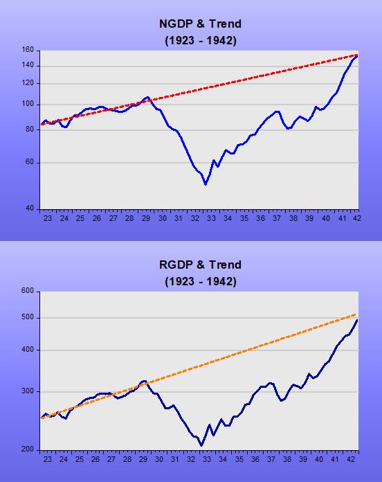
How does that square with the evidence? To illustrate we look at two periods, the “Great Inflation” of the 70s and the “Great Moderation” (1987 – 2005).

During the “Great Inflation”, it seems the Thermostat broke down and the “temperature” kept rising above “normal”. During the “Great Moderation”, it appears the Thermostat worked just fine, keeping the “temperature” close to normal levels at all times.

How does the stability of the trend level path for nominal spending (NGDP) translate to the growth rate view? In the next charts, we observe that during the “Great Inflation” the “temperature” oscillated on a rising trend, while during the “Great Moderation” it was much more stable with no trend.

If the Thermostat is working fine, according to Friedman stabilizing nominal expenditures along a level growth path means stabilizing both inflation and output.

The next charts show that is the observed outcome.

On average, real growth is similar in both periods, while the volatility (standard deviation) of growth is 50% (1.3 vs 2.6) lower.

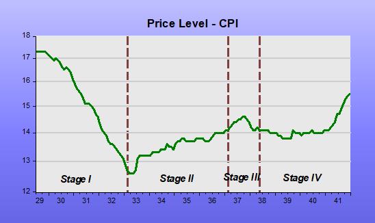
Note that price & wage controls work like putting a wet cloth on the patient´s forehead to reduce fever, as doctors did in the Middle Ages! As soon as you take away the wet cloth, temperature rises.

An interesting takeaway gleaned from the results following the application of Friedman´s Fed Thermostat, is that the 70s was no “stagflationary decade” as pop culture has it. It was just the “inflationary decade”.

It also shows that comments as the one below are plainly wrong:

“We are right to fear inflation. The 1970s was a colossal disaster and economists still can’t even agree on what exactly went wrong.”

Having understood the meaning and usefulness of “Friedman´s Thermostat”, we can use it to explain what happened after Bernanke took over as Chair in January 2006.

“Dialing down” the economy

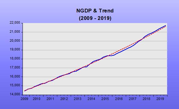
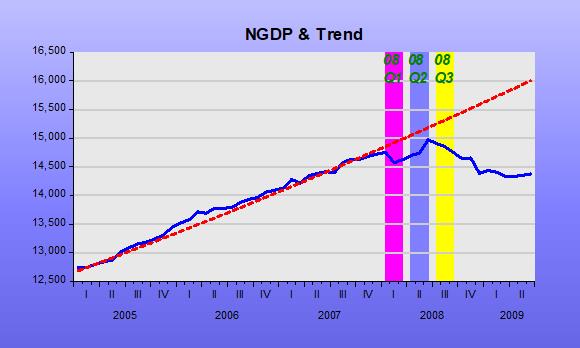
AS the chart shows, when Bernanke began his tenure as Fed Chair, initially he kept nominal spending (NGDP) evolving close to the trend level path. Around mid-2007, he began to worry about the potential inflationary effects of low unemployment (4.4%, below their estimate of the natural rate) and rising oil prices.

At that point, money demand was on a rising trend (falling velocity) due to the uncertainties flowing from the financial sector problems that were brewing (remember the “start date” of the financial crisis was August 07 when two funds from Paribas were closed for redemption) and money supply growth was “timid”. As a result, nominal spending began to fall below trend.

In mid-08, the FOMC became very concerned about inflation. After all, in the 12 months to June 08 oil prices doubled. Bernanke´s summary of that meeting discussions is unequivocal evidence that the Fed´s goal was to “dial down” the Thermostat (or “cool”) the economy!

FOMC Meeting June 2008 (page 97):

“My bottom line is that I think the tail risks on the growth and financial side have moderated. I do think, however, that they remain significant. We cannot ignore them. I’m also becoming concerned about the inflation side, and I think our rhetoric, our statement, and our body language at this point need to reflect that concern. We need to begin to prepare ourselves to respond through policy to the inflation risk; but we need to pick our moment, and we cannot be halfhearted. When the time comes, we need to make that decision and move that way because a halfhearted approach is going to give us the worst of both worlds. It’s going to give us financial stress without any benefits on inflation. So we have a very difficult problem here, and we are going to have to work together cooperatively to achieve what we want to achieve.”

Before that meeting, the fall in nominal spending below trend was likely the result of unintended mistakes in the calibration of the thermostat, in the sense that the increase in money supply failed to fully offset the fall in velocity. During the second half of 2008, however, money supply growth decreased sharply, especially after the Fed introduced IOER in October. That certainly qualifies as “premeditated crime”!

The 2008-09 recession (dubbed “Great”) is more evidence for the relevance of the “Thermostat Framework” spelled out by Friedman. It was the conscious “dialing down” of the thermostat by the Fed, not the house price bust or the associated financial crisis, that caused the deep recession.

The charts below illustrate the impact of the “dialing down of the thermostat” by the Fed.

What comes next, however, puts the “Thermostat Analogy” in “all its glory”, in addition to dispelling the notion made popular by Carmen Reinhart and Kenneth Rogoff that this recovery was slow because it followed a financial crisis.

In short, once the economy was “cooled”, the Fed never intended to “warm it up” to the previous trend level path, keeping the thermostat working fine for the lower temperature the Fed desired.

The implications of a well-functioning thermostat are evident in the charts below.

1 Nominal spending is kept stable along a (lower) level path

2 Both real output and inflation are stabilized (also at a lower rate)

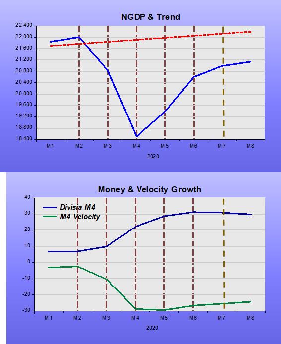
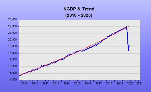
The next chart (which makes use monthly NGDP from Macroeconomic Advisers) shows what happened following the Covid19 “attack”.

This is not like 2008. This time around, the Fed had no hand in the outcome. The virus came out of left field and “crunched” both the supply and demand “armies”, leading to a sudden “drop shock” in nominal spending.

Money demand jumped (velocity tanked). The next chart shows that the Fed reacted in the right way, with a lag, given the surprise attack.

The economy faces a health issue with mammoth economic consequences. The thermostat dialed the temperature down “automatically” and will likely maintain the “cooler temperature” while the virus is “active”. All the Fed can do is work to ensure the temperature does not fall even more. Given the latest data available (May), it appears the Fed is managing to “hold the fort”.

What the inflacionistas worry is with the aftermath, after the virus loses relevance. They argue the massive rise in the money supply observed so far ensures an inflation boom in the future.

As the thermostat analogy indicates, you have to take into account the behavior of velocity (money demand). So far, even with the “Federal Reserve pouring money into the economy at the fastest rate in the past 200 years”, what we observe is disinflation!

How will the Fed behave once the virus loses relevance? Will it set the thermostat at the previous temperature (previous trend level path)? In other words, will it make-up for the losses in nominal spending incurred during the pandemic, or not?

In this post, David Beckworth argues that there is no evidence the Fed plans to undertake a make-up policy, concluding:

“So wherever one looks, make-up policy is not being forecasted. Its absence does not bode well for the recovery and underscores the urgency of the FOMC review of its framework. I really dread repeating the slow recovery of the last decade. So please FOMC, bring this review to a vote and give make-up policy a chance during this crisis.”

After the Great Recession, the Fed chose not to “make-up”. The chart illustrates

What will it be this time around?

If the Fed undertakes a make-up policy, inflation will temporarily rise (just as it temporarily fell when the thermostat was dialed down). The impossible dream I have is that the Fed not only makes up for the virus-induced loss, but also partly for the loss incurred by its misguided policy of 2008!

As always, the inflation obsession will the greatest barrier the Fed will face. No wonder more than 40 years ago James Meade warned that inflation targeting was “dangerous”.

PS Update to the last chart above with data to August 20. The “bad outcome” seems to be transpiring!

Toying with business cycle dating

In this year´s ASSA Annual Meeting in January, Christina & David Romer (R&R) presented “NBER Business Cycle Dating: Retrospect and Prospect”:

“…Our most substantial proposal is that the NBER continue this evolution by modifying its definition of a recession to emphasize increases in economic slack [Deviations from potential output and/or unemployment] rather than declines in economic activity…”

“…Throughout the paper, we make use of Hamilton´s (1989) Markov switching model as a framework for investigating and assessing the NBER dates. Though judgement will surely never be (and should not be) eliminated from the NBER business cycle dating process, it is useful to see what standard statistical analysis suggests and can contribute.”

On page 32, they move to Application: The implications of a two-regime model using slack for dating US business cycle since 1949:

“We have argued that a two-regime model provides insights into short-run fluctuations. And we have argued for potentially refining the definition of a recession to emphasize large and rapid increases in economic slack rather than declines in economic activity. Here, we combine the two approaches by applying Hamilton´s two-regime model to estimates of slack and exploring the implications for the dating of postwar recessions.”

According to R&R (page 34):

“The largest disagreement between the two regimes estimates using slack and the NBER occurs at the start of the Great Recession. The NBER identifies both 2008Q1 and 2008Q2 as part of the recession (with the peak occurring in 2007Q4), while our estimates (see table 1) put the probability of recession as just 21% in 2008Q1 and 43% in 2008Q2.”

Table 1 Economic Performance going into the Great Recession

Quarter NBER Date

In Recession?

Agreement of 2-Regime Model Shortfall of GDP from Potential Unemployment minus Nat Rate
2007Q4 No 97% -0.6% 0.6%
2008Q1 Yes 21% 4.2% 0.9%
2008Q2 Yes 43% -0.2% 1.4%
2008Q3 Yes 91% 3.9% 2.7%

It is somewhat confusing! The 2-Regime model only “fully” agrees with the NBER that the economy was in a recession from 200Q3. The GDP gap roams all over the place, while the unemployment gap is increasing consistently over time.

Although R&R suggest the NBER emphasize measures of slack, those measures are very imprecise. This is clear given the CBO systematic revisions of potential output in the chart below.

Since I´m “toying” with dates, I´ll try using the NGDP Level target yardstick to see what it says about the Great Recession. (Useful recent primers on Nominal GDP Level Targeting are David Beckworth and Steve Ambler).

In the years preceding the Great Recession, there were many things happening. There was the oil shock that began in 2004 and gathered force in subsequent years. There was the bursting of the house price bubble that peaked in mid-2006 and, from early 2007, the problems with the financial system began, first affecting mortgage finance houses but soon extending to banks, culminating in the Lehmann fiasco ofSeptember 2008.

The next chart  the oil and house price shocks.

The predictable effect of an oil (or supply) shock is to reduce the real growth rate and increase inflation (at least that of the headline variety). The charts indicate that was what happened.

The chart below shows that when real growth fell due to the supply shock, real output (RGDP) dropped below the long-term trend (“potential”?). Does this mean the economy is in a recession? If that were true, the recession would have begun in 2006!

In that situation, how should monetary policy behave? Bernanke was quite aware of this problem. Ten years before, for example, Bernanke et al published Systematic Monetary Policy and the Effects of Oil Price Shocks”. (1997)

In the conclusion, they state:

“Substantively, our results suggest that an important part of the effect of oil price shocks on the economy results not from the change in oil prices, per se, but from the resulting tightening of monetary policy. This finding may help to explain the apparently large effects of oil price changes found by Hamilton and many others.”

In the chart below, we observe that during his first two years as Chair, Bernanke seems to have “listened to himself” because NGDP remained very close to the target level path all the way through the end of 2007.

With NGDP kept on target, the effects of the supply shock are “optimized”. Headline inflation, as we saw previously will rise, but if there is little or no change in NGDP growth, core measures of inflation will remain contained.

During the first quarter of 2008, NGDP was somewhat constrained. This likely reflects the FOMC´s worries with inflation. RGDP growth dropped further, but during the second quarter of 2008, the Fed seemed to be trying to get NGDP back to trend. RGDP growth responded as expected and core inflation remained subdued.

At that point, June 2008, it appears Bernanke reverted to focus almost singly on inflation, maybe remembering what he had written 81/2 years before in What Happens when Greenspan is gone? (Jan 2000):

“U .S. monetary policy has been remarkably successful during Alan Greenspan’s 121/2 years as Federal Reserve chairman. But although President Clinton yesterday reappointed the 73-year-old Mr. Greenspan to a new term ending in 2004, the chairman will not be around forever. To ensure that monetary policy stays on track after Mr. Greenspan, the Fed should be thinking through its approach to monetary policy now. The Fed needs an approach that consolidates the gains of the Greenspan years and ensures that those successful policies will continue; even if future Fed chairmen are less skillful or less committed to price stability than Mr. Greenspan has been.

We think the best bet lies in a framework known as inflation targeting, which has been employed with great success in recent years by most of the world’s biggest economies, except for Japan. Inflation targeting is a monetary-policy framework that commits the central bank to a forward-looking pursuit of low inflation; the source of the Fed’s current great performance; but also promotes a more open and accountable policy-making process. More transparency and accountability would help keep the Fed on track, and a more open Fed would be good for financial markets and more consistent with our democratic political system.”

This is evident in his summary of the FOMC Meeting June 2008 (page 97), where Bernanke says:

“My bottom line is that I think the tail risks on the growth and financial side have moderated. I do think, however, that they remain significant. We cannot ignore them. I’m also becoming concerned about the inflation side, and I think our rhetoric, our statement, and our body language at this point need to reflect that concern. We need to begin to prepare ourselves to respond through policy to the inflation risk; but we need to pick our moment, and we cannot be halfhearted. When the time comes, we need to make that decision and move that way because a halfhearted approach is going to give us the worst of both worlds. It’s going to give us financial stress without any benefits on inflation. So we have a very difficult problem here, and we are going to have to work together cooperatively to achieve what we want to achieve.”

From that point on, things derailed and a recession becomes clear in the data. It appears the NGDP Level Targeting framework agrees with Hamilton´s 2-regime model that the recession was a fixture of 2008Q3.

If NGDP had not begun to tank in 2008Q3, a recession might, later, have been called before 2008Q3, but it would never have been dubbed “Great”, more likely being short & shallow.

The takeaway, I believe, is that the usual blames placed on the bursting of the house price bubble, which led to the GFC and then to the GR is misplaced. Central banks love that narrative because it makes them the “guys who saved the day” (avoided another GD) when, in fact, they were the main culprits!

PS: The “guiltless” Fed is not a new thing. Back in 1937, John Williams (no relation to the New York Fed namesake), Chief-Economist of the Fed, Board Member and professor at Harvard (so unimpeachable qualifications, said about the 1937 downturn:

If action is taken now it will be rationalized that, in the event of recovery, the action was what was needed and the System was the cause of the downturn. It makes a bad record and confused thinking. I am convinced that the thing is primarily non-monetary and I would like to see it through on that ground. There is no good reason now for a major depression and that being the case there is a good chance of a non-monetary program working out and I would rather not muddy the record with action that might be misinterpreted.

The usefulness of underlying, or core, rates

It is the case, instead, of not missing the trees for the forest. The case for core inflation, for example, is well established, but not always understood. The charts below show that sometimes the qualitative information given by “trees & forests” or core and headline rates is the same, but at other times, “trees & forests” look very different.  In 2007-08, the Fed took drastic and wrong actions because it only looked at the “forest” and missed the “health of the trees”.

The next chart shows the effect of the “sudden drop shock” brought on by Covid19. With economic activity “dumped”, temporary lay-offs skyrocketed.

Temporary lay-offs have since decreased, bringing headline unemployment down. Should we be “thrilled” by the falling headline unemployment, or are we missing the more durable effects of the wild swings in temporary lay-offs? In effect, these lay-offs may increase again following the pick-up in infections since the last data collection period for the employment report.

In order to have a better understanding of what´s happening to the trend in unemployment, we have to strip-out this highly (and distorting) volatile element. Our measure of core unemployment includes those called marginally attached (which are not in the labor force but want to work) and excludes those defined as on temporary lay-offs. In practice, it defines core unemployment by subtracting temporary lay-offs from the U-5 definition of unemployment.

The chart below shows that for most of the time, headline & core unemployment gave out the same information about unemployment.

Since the Covid19 “sudden drop shock”, however, they diverge “majestically”.

The underlying or core unemployment trend trend reversed direction in July. Hopefully this reversal will be confirmed with the data for August.