Will the Increase in the Consumption Tax Derail Abenomics?

The WSJ has a piece which closely reflects the consensus view on the matter: “Japan´s Sales-Tax Boost will Test Abenomics”:

The tax increase is designed to pay for Japan’s ballooning social-welfare costs and to pare its huge public debt, which, at more than twice the size of the economy, is the largest among rich nations. But it comes at an inopportune moment for Tokyo, which hopes Japan’s cautious consumers continue to spend after more than 15 years of debilitating deflation.

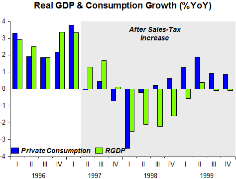
History isn’t reassuring. In April 1997, when the government last raised the sales tax, to 5% from 3%, consumption took a dive and—along with the effects of the Asian financial crisis—pushed Japan into deflation and a recession that lasted more than 18 months.

And shows a version of the chart below:

Japan CT_1

Inflation (core-core, which excludes fresh food and energy) temporarily jumped:

Japan CT_2

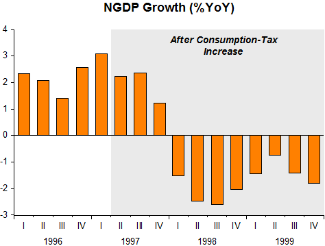
Given Japan´s implicit zero inflation target, monetary policy was severely constrained, with aggregate nominal spending (NGDP), something over which a central bank has close control, registering a sequence of negative rates of growth.

Japan CT_3

What if monetary policy had not worked to reinforce the contractionary effects of the consumption tax hike?

Given the “anti-deflation philosophy” of Abenomics, it is very unlikely that the BoJ will do an encore of 1997. In their evaluation of inflation they won´t validate the (temporary) increase in inflation to their 2% target.

The charts below show that after a string of negative inflation and NGDP growth, “Abenomics” appears to have reversed the trends. Now it´s up to Abe and Kuroda to “keep the flame burning”!

Japan CT_4

What Jeremy Stein really meant

JStein:

I am going to try to make the case that, all else being equal, monetary policy should be less accommodative–by which I mean that it should be willing to tolerate a larger forecast shortfall of the path of the unemployment rate from its full-employment level–when estimates of risk premiums in the bond market are abnormally low. These risk premiums include the term premium on Treasury securities, as well as the expected returns to investors from bearing the credit risk on, for example, corporate bonds and asset-backed securities. As an illustration, consider the period in the spring of 2013 when the 10-year Treasury yield was in the neighborhood of 1.60 percent and estimates of the term premium were around negative 80 basis points. Applied to this period, my approach would suggest a lesser willingness to use large-scale asset purchases to push yields down even further, as compared with a scenario in which term premiums were not so low.

So that readers don´t have any doubts about Stein´s meaning, my friend and reader Catherine Johnson provides a prize-winning translation:

I believe the Federal Reserve should block full employment any time interest rates on bonds are abnormally low.

I believe the Federal Reserve should keep people out of work any time interest rates on bonds are abnormally low.

I believe the Federal Reserve should slow the economy’s growth any time interest rates on bonds are abnormally low.

I believe that when money is tight, we should make it tighter.

Esther George needs a new lens prescription

Kansas City Fed President Esther George said Friday she saw signs of higher inflation that would gradually move price rises towards the Federal Reserve’s 2% target.

Speaking before business leaders in Kansas City, she cited signs of upward wage pressures and emerging problems for some companies in hiring specialized workers.

She needs to look at the facts!

Esther George

More “debate” with Mian and Sufi´s “House of Debt”

Recently I´ve been having a “debate” with Atif Mian and Amir Sufi (A&A)(here, here). Now they write “Monetary Policy and Secular Stagnation”:

The Federal Reserve directly controls the short-term interest rate. But what it really tries to target is inflation and its expectations. The Fed’s goal is to achieve the target of 2% inflation in the long-term, and its preferred price index is the core personal consumption expenditure price index that excludes the volatile food and energy sectors (or core PCE for short). So how has the Fed performed in achieving its target of 2% inflation in the past 15 years?

And show a version of this chart:

A&A_1

The chart above plots the implied core PCE index if inflation had met its 2% target (red line), and the actual core PCE index (blue line) starting from 1999.  The blue line is consistently below the red line, the gap has only diverged further since the Great Recession. The cumulative effect is that today the price level is 4.7% below what it should have been had the Fed achieved its long-run target.

They´re quite right to say that what the Fed “really tries to target is inflation and its expectations”. But until very recently (January 2012) that was just an “implicit” target. In fact, Greenspan was staunchly against making any target explicit. That was Bernanke´s pet project. What the Fed said it wanted was “low and stable” inflation.

The other thing wrong with A&A´s argument is that they are discussing a “Price Level Target (PLT) and surely that was not what the Fed was targeting, even implicitly. A PLT differs from an Inflation Target (IT) in that while in the former bygones are not bygones, in the latter they are.

A&A continue misleading their readers:

The divergence between target and actual inflation is all the more striking given the elevated rate of unemployment during the sample period. We have discussed in a previous post how the post-2001 and post-2009 recoveries were “jobless” – a recovery in output but not much in employment. The Fed has a dual mandate – inflation targeting and maximizing employment. It is traditionally believed that there is a trade-off between the two and a higher level of unemployment permits the Fed to go beyond its 2% inflation target (this is the famous Taylor rule). Yet the Fed has failed to achieve its target inflation despite high unemployment rates.

To say the level of unemployment was “elevated” during the sample period is very misleading. For the 1999-07 period the average rate of unemployment was a very low by historical standards 4.9%, only going up strongly when the crisis hit. And PCE-Core inflation averaged 1.9% in 1999-07, therefore very close to the 2% implicit target rate! [Note: In my posts “debating” A&A linked to above, I have shown what really caused the jobless recovery after the 2001 recession as well as the job loss recovery in the present cycle]

They go on:

It is hard to fault the Fed for not trying – it brought short term rates to zero for an extended period of time, and bought trillions of dollars in bonds. Yet the gap between the red and blue lines continued to diverge.

The Fed’s difficulty in maintaining a 2% target is not just about the Great Recession. The divergence started in the 2000′s despite the Fed keeping nominal rates quite low by historical standards. In fact the only period when the blue line runs parallel to the red (implying a 2% rate of inflation for a while) is the 2004-2006 period when the economy witnessed an unprecedented growth in credit.

Their blog (and forthcoming book) is called “House of Debt”, so debt has to figure prominently in their argument. But as the chart shows, the debt/GDP ratio begin to rise strongly in 2000 (not 2004) and continued going up until 2007. Note that all the debt increase is explained by mortgage debt. For that one should look to the distorted incentives mostly provided by the government´s homeownership policy.

A&A_2

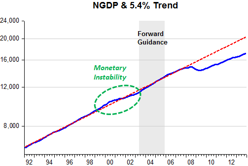
But it´s interesting that they note that prices picked up in 2004-06. That was not because of an “unprecedented growth in debt” but because with the Fed adopting forward guidance in August 2003, monetary policy became more expansionary and allowed nominal spending (NGDP) to climb back to trend after the nominal instability that marked the 1998-03 period. The chart illustrates:

A&A_3

A&A conclude:

What we are witnessing is the limit of what monetary policy alone can do. Sometimes there is a tendency to assume that the Fed can “target” any inflation rate it wishes, or that it can target the overall price level – the so-called nominal GDP targeting. The evidence suggests that the Fed may not be so omnipotent.

We are witnessing no such limit. What we are witnessing are the unsatisfactory effects of an Ad Hoc and timid stance of monetary policy (indicated by the lack of convergence of nominal spending towards trend). A&A also make the mistake of saying that PLT is the same as NGDPLT. As the first and last chart show, they´re not!

Ho! Ho! Ho!

From Charles Evans, of “Evans-Rule” fame:

As you all know, in response to the unusual economic circumstances generated by the financial crisis and the Great Recession, the FOMC lowered our traditional policy tool — the target federal funds rate — to near-zero levels in December 2008 and has kept it there since. With the fed funds rate constrained at this lower bound, and economic conditions requiring additional policy accommodation, the Committee also deployed nontraditional policy tools to stimulate activity. We embarked upon large-scale purchases of long-term Treasury securities and agency mortgage-backed securities. We also used new communications tools to provide forward guidance about how long short-term interest rates will essentially remain at their lower bound of zero.

He has the ‘causality’ reversed. The “unusual economic circumstance” was generated by excessively tight monetary policy, which caused the Great Recession and made the financial crisis much worse!

Ryan Avent has a more pointed take:

Not only is the Fed not raising its inflation target, it is tightening while inflation remains well below the 2% target (as it has about 90% of the time since the 2% target was announced in 2012); indeed, just today we learned that the Fed’s preferred inflation gauge rose at just 0.9% in the year to February, down from 1.2% in January. Inflation is also falling in Britain (from 1.9% in January to 1.7% in February). And it is tumbling in Europe. New figures show that Spain has fallen into deflation, making five euro-area economies experiencing outright declines in the price level.

The rich world’s central banks are behaving with a dangerous complacency. Low and falling inflation will retard ongoing recoveries. Perhaps more important, this path forward leaves the rich world with virtually no cushion against future shocks.

Central banks talk an awful lot about the importance of credibility. But talk is cheap. I’m not sure how the Fed can expect anyone to take its word seriously when it has undershot its target nearly every month that target has been in place, when its forecasts make clear that it fully intends to undershoot that target for years to come and indeed on average, and when it is busy pulling away support to the economy while inflation falls ever farther below 2%. It’s a joke.

Ironically, as soon as the Fed made the 2% target official in January 2012, inflation has stubbornly dropped below target!

ZLB_1

And the ‘taper talk’ and its later implementation have destabilized both medium and longer term inflation expectations which have dropped and stayed down, a clear sign that monetary policy has become tighter!

ZLB_2

And there´s little hope for meaningful changes while monetary policy remains “Ad Hoc”.

57 months into the recovery and the economy is still depressed. Why?

Atif Mian and Amir Sufi write: “Jobless Recovery in one Chart”. They borrow this chart from Ed Leamer:

Jobless Recoveries_01

And write:

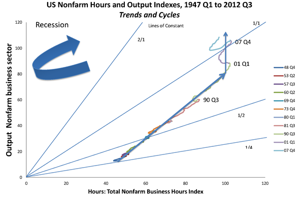
On the horizontal axis is the total amount of hours worked. On the vertical axis is the total output of the business sector. Leamer plots hours and output since WWII. Before 2001, we saw a steady expansion of both output and hours–we move in the northeast direction of the chart.

Recessions are times when we move to the southwest of the chart — hours and output drop. Recoveries should be times when we move back to the northeast–output and hours increase. That’s exactly what happened after all post WWII recessions, until 2001.

In 2001 and in the Great Recession, the recovery moves us straight north in the chart, not to the northeast. Output recovers, but jobs don’t.

That´s right. But why? I think monetary policy, as practiced during the recoveries, helps explain much of the jobless recovery after the 2001 recession and the job loss recovery following the 2007-08 recession.

The panel below shows what happened to nominal spending (NGDP or Aggregate Demand), real output (RGDP) and inflation during the 18 quarters from the start of the recovery following the 1981-82, 1990-91, 2001 and 2007-09 recessions.

The Fed controls nominal spending pretty closely. The recovery from the 1981-82 recession (that marked the end of the ‘Great Inflation’ years) was exuberant or robust and note that there was no loss of inflation control.

Jobless Recoveries_1

The recovery after the 1990-91 recession was much more subdued. Granted the fall had also been much milder. There was talk of the Fed engaging in ‘opportunistic disinflation’. The fact is that nominal spending growth didn´t rise immediately and when it did it was restrained. Inflation came down a few notches.

Jobless Recoveries_2

The recovery from the 2001 recession was surprising at the time, being famously called ‘jobless recovery’. Note that nominal spending growth only rises after inflation had fallen to undesirable levels, with the Fed talking about the risk of deflation!

Jobless Recoveries_3

And the last chart shows that not only the drop this time around was very deep but there´s no compensating spending growth that would be required to bring unemployment down. This time it´s more of a ‘job loss’ non recovery. And the Fed seems completely satisfied with that state of affairs. If not it would be fully engaged in getting spending up, just as it did in 2003 when there was a whiff of deflation.

Jobless Recoveries_4

Instead we see the opposite, with the discussion going the way of an earlier tightening so as to avoid the onset of financial instability!

Yes Janet, by all means “mind the gap”

In “Mind the (spending) gap”. Atif Mian and Amir Sufi of Princeton and Chicago, respectively, are on the right track but go about it the wrong way and so arrive at a wrong conclusion. They wonder:

We all know that households cut back on spending dramatically during the Great Recession. Are they spending now? Has spending caught up to the trend the United States was on before?

The red line in the chart below plots retail spending in real terms in the United States from 1992 to 2013. We want to get a sense of the trend in spending so we plot spending on a logarithmic scale, and we subtract off the 1992 level to start the line at zero. A logarithmic scale is informative because a straight line in the chart would imply that spending was growing at a constant rate in real terms.

Mind Spending Gap_1

Why aren’t we getting back to trend? One answer often given is that the housing boom artificially boosted spending from 2002 to 2006, and so the trend we were on was an unrealistic benchmark that could not be sustained.

But the data contradict that story. There is no evidence that spending was above trend from 2002 to 2006. In the chart above, the red line doesn’t go above the black dots during the housing boom. Further, there is no evidence that the economy was overheating in terms of capacity from 2002 to 2006. House prices were booming, but other measures of inflation were steady.

Instead, the chart above may be evidence corroborating the worrisome “secular stagnation” view. The housing boom fueled household spending, but that spending only kept us on the same path we were on before – and it was done by enticing debtors to borrow and spend out of ephemeral housing wealth. When the housing boom disappeared, the permanent adjustment downward in the chart above suggests that we were already on a secular decline in household spending that the housing boom masked temporarily.

Why focus on one component of spending? Why do it in real (inflation adjusted) terms? What we should be interested in is in the total dollar amount of spending, i.e. NGDP, something closely influenced by the Fed´s monetary policy. As the chart shows, the overall story has the same pattern.

Mind Spending Gap_2

What the chart suggests is not that we were already in a secular decline in aggregate spending (not only household spending), but that the Fed allowed aggregate nominal spending (NGDP or AD) to tank. And aggregate spending has not caught up to trend for the very simple reason that the Fed has not allowed it to grow sufficiently to do so. And why not? Because it is terrified of any rise in inflation that might accompany it, even though inflation is still far below the Fed´s target!

The end result is that we are mired in a depression. That didn´t (and doesn´t) have to be so. And “suggesting” we were already in a secular decline which was “masked” is just “lazy-thinking” on the part of the honorable professors.

Bubble mania

Scott Sumner has a post over at Econlog “Endless bubbles”. He´s still trying to find an occasion when Robert Shiller recommended being long stocks…The only reference to “buying stocks” by Shiller I found was this from a Davos interview last January:

Nobel prize-winning economist Robert Shiller told CNBC at the World Economic Forum that he is still investing in the stock market despite warning of bubble-like conditions.

Shiller said that his own long-term valuation metric for stock markets, which measures price-to-earnings based on average inflation-adjusted earnings over the previous 10 years, was currently high at 25. But it was still well below the record high of 46 reached in 2000.

The most famous “bubble occasion” was back in 1996.

WSJ “Greenspan Pops the Question: Is the Stock Market Overvalued?” (December 1996)

WASHINGTON — On the morning of Dec. 3, 1996, having watched the Dow surge a dizzying 27% that year, Federal Reserve Board Chairman Alan Greenspan hosted a private meeting that became his own genteel version of the debate show “Crossfire.”

On one side was Abby Joseph Cohen, the belle of the bull market, who came from her post at Goldman, Sachs & Co. to defend investor sanity. She methodically gave Fed governors a list of reasons why underlying economic changes justified such lofty prices in the market.

On the other side were two Ivy League economists, Yale’s Robert Shiller and Harvard’s John Campbell, who painted a much gloomier picture, though they didn’t address Ms. Cohen’s comments directly. They illustrated their message of portent in 10 pages of handouts showing trends going back to 1872. The markets were destined, at best, to tread water, and possibly to crash, they warned.

As unusual as that meeting was, it didn’t compare to what would follow two days later. At a black-tie banquet at the Washington Hilton, Mr. Greenspan delivered a speech that would contain the most memorable utterances of his career: “How do we know when irrational exuberance has unduly escalated asset values? … And how do we factor that assessment into monetary policy?”

Minutes after he spoke, stocks began tumbling in Tokyo, where the markets were open. That was followed by more carnage in Europe, then the U.S. Over the next few weeks, the Dow Jones Industrial Average slipped 4% from its then-record of 6400. Back at Yale, Prof. Shiller’s wife penned a Christmas letter to friends: “Recently, Bob has been troubled by the thought that he may have caused a worldwide stock market slide.”

Other notable examples.

Krugman in “Ice Age Cometh” (May 1998):

The more I look at the amazing rise of the U.S. stock market, the more I become convinced that we are looking at a mammoth psychological problem. I don’t mean mammoth as in “huge” (though maybe that too), but as in “elephant”. Let me explain.

If you follow trends in psychology, you know that Freud is out and Darwin is in. The basic idea of “evolutionary psych” is that our brains are exquisitely designed to help us cope with our environment – but unfortunately, the environment they are designed for is the one we evolved and lived in for the past two million years, not the alleged civilization we created just a couple of centuries ago. We are, all of us, hunter-gatherers lost in the big city. And therein, say the theorists, lie the roots of many of our bad habits. Our craving for sweets evolved in a world without ice-cream; our interest in gossip evolved in a world without tabloids; our emotional response to music evolved in a world without Celine Dion. And we have investment instincts designed for hunting mammoths, not capital gains.

The Economist “America´s bubble economy” (April 1998):

AN ECONOMIST, it is said, is an expert who will know tomorrow why the things he predicted yesterday did not happen today. So what will be tomorrow’s explanation of why share prices continue to soar today despite frequent warnings from many commentators (including The Economist) that Wall Street is overvalued? The most popular explanation within America is that it has entered a new economic era of faster, inflation-free growth, and hence stronger profits, thanks to new technology and globalisation. We beg to differ: America is experiencing a serious asset-price bubble.

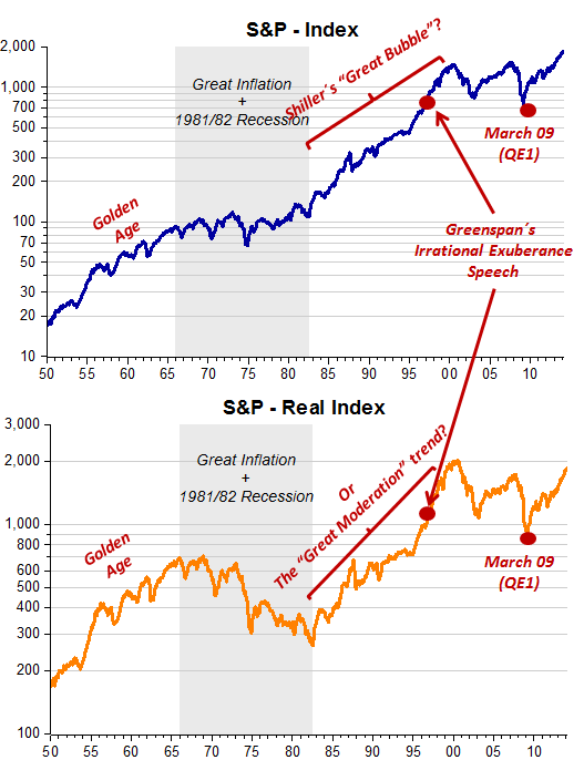
The charts depict the stock market (S&P) in both nominal and real (inflation-adjusted) terms and Shiller´s 10 year trailing P/E ratio. Bubbles or Macroeconomic Fundamentals? Take your pick!

Bubble Mania_1

Bubble Mania_2


It´s in their DNA

In his first ‘free speech’ earlier this month Bernanke lied (though he was not under oath):

(Reuters) – Former Federal Reserve Chairman Ben Bernanke said the U.S. central bank could have done more to fight the country’s financial crisis and that he struggled to find the right way to communicate with markets.

“We could have done some things on the margin to mitigate somewhat the crisis,” Bernanke, 60, said on Tuesday in his first public speaking engagement since he stepped down in January after eight years heading the Fed.

“Although we have been very aggressive(!), I think on the monetary policy front we could have been even more aggressive.”

Let´s see (via John Taylor):

Dec 2008: “Exceptionally low levels…for some time…”

Mar 2009: “…for an extended period…”

Aug 2011: “…at least through mid-2013…”

Jan 2012: “…late 2014…”

Sep 2012: “…through mid-2015…”

Dec 2012: “…at least as long as the unemployment rate remains above 6 ½ percent…”

And then in May 2013 he thought that it was appropriate to signal the start of ‘the taper’! Was that viewed as “aggressive” monetary policy? Maybe an “aggressive tightening”! This is the story told by medium and long term inflation expectations. See how they plunge when the “taper talk” began.

DNA_1

Being an inflation targeter is in Bernanke´s DNA. In January 2012, almost four years after NGDP crashed, Bernanke realized his “life-long dream” and got his preferred 2% inflation target become official policy. To me that shows he didn´t think his inflation obsession in 2008 had any influence in the crisis.

After all, he was the editor of the book that helped disseminate the idea. And as far back as January 2000, while still an academic, he laid down his blueprint for the Fed in “What happens when Greenspan is gone?

U .S. monetary policy has been remarkably successful during Alan Greenspan’s 121/2 years as Federal Reserve chairman. But although President Clinton yesterday reappointed the 73-year-old Mr. Greenspan to a new term ending in 2004, the chairman will not be around forever. To ensure that monetary policy stays on track after Mr. Greenspan, the Fed should be thinking through its approach to monetary policy now. The Fed needs an approach that consolidates the gains of the Greenspan years and ensures that those successful policies will continue; even if future Fed chairmen are less skillful or less committed to price stability than Mr. Greenspan has been.

We think the best bet lies in a framework known as inflation targeting, which has been employed with great success in recent years by most of the world’s biggest economies, except for Japan. Inflation targeting is a monetary-policy framework that commits the central bank to a forward-looking pursuit of low inflation; the source of the Fed’s current great performance; but also promotes a more open and accountable policy-making process. More transparency and accountability would help keep the Fed on track, and a more open Fed would be good for financial markets and more consistent with our democratic political system.

Now Yellen´s turn:

March 2014:  “…the language that we use in this statement is considerable, period…. this is the kind of term it’s hard to define, but, you know, it probably means something on the order of around six months or that type of thing…”

As Hilsenrath notes:

Wall Street is abuzz about rising interest rate projections released by the Federal Reserve Wednesday in a supplement to its official policy statement. A careful reading of these scatter plot projections suggests the central bank’s camp of policy “doves” shifted its interest rate views slightly upward in March.

As Jim Pethokoukis has transcribed:

In the end, the Fed has eliminated the 6.5% trigger that wasn’t a trigger. Yellen has replaced it with a laundry list of things that matter with no objectives for any of them. We are back in the land of discretion. Rules did not work, because the Fed set the wrong rules. But the policy objective of price stability- and that means 2% inflation- is still there and still not being met. Moreover, the Fed is willing to hike rates and slow progress toward the 2% goal long before we get there, an act that slows the drop in the already too-high rate of unemployment.

The Phillips Curve is in Yellen´s DNA. Travel back to the September 1996 FOMC meeting:

MS. YELLEN. Thank you, Mr. Chairman. I can support your proposal to adopt an unchanged policy with an asymmetric directive and to continue to evaluate incoming data as it bears both on the degree of momentum in demand and the inflationary pressures latent in the current environment. But I find myself very close to the margin and would also have been quite willing to support an upward adjustment of 25 basis points today, had you proposed that. I can support your proposal because, for the reasons that I outlined earlier and you explained in fascinating detail, this is an unusual episode. I believe we are still at quite an early stage of an inflationary uptick, if indeed this turns out to be one. I also agree that with demand moderating and current inflation stable or falling, we may end up deciding that it is unnecessary to move the funds rate upward.

But having said that, I believe that a very solid case can also be made for raising the federal funds rate at least modestly, by 25 basis points, on the grounds that the unemployment rate has notched down further, the decline in labor market slack is palpable, and the odds of a rise in the inflation rate have increased, whatever the level of the NAIRU and the associated level of those odds. I believe I am echoing Governor Meyer in saying that I favor a policy approach in which, absent clear contra-indications, our policy instrument would be routinely adjusted in response to changing pressures on resources and movements in actual inflation.

That pretty well describes her thinking-mode almost 20 years later!

Her “partner” Laurence Meyer gave a speech a few months later, in April 1997, that leaves no doubt about where they stood (and where she still stands):

Let me remind you at the outset of the framework I have been using to explain the challenge facing monetary policy in the current environment of healthy growth and high levels of resource utilization. The risk of higher inflation in this environment has two dimensions. First, there is the risk that current utilization rates are already so high that inflation will gradually increase over time. Second, there is the risk that the growth in output will be above trend going forward, implying that utilization rates will rise from their already high level, compounding the risk of higher inflation.

The recent Federal Reserve policy action was clearly a preemptive one. This means that it was undertaken not in response to where the economy and inflation were at the time of the policy change, but in response to where the economy and inflation were projected to be in the future, absent a policy change. Such policy action necessarily involves a forecast and such a forecast typically is grounded in some model that relates growth, unemployment, wage change and inflation, among other variables. So let me be specific about the causal structure of the model that underpins my judgment with respect to appropriate monetary policy action.

I am a strong and unapologetic proponent of the Phillips Curve and the NAIRU concept. Fundamentally, the NAIRU framework involves two principles. First, the proximate source of an increase in inflation is excess demand in labor and/or product markets. In the labor market, this excess demand gap is often expressed in this model as the difference between the prevailing unemployment rate and NAIRU, the non-accelerating inflation rate of unemployment. Second, once an excess demand gap opens up, inflation increases indefinitely and progressively until the excess demand gap is closed, and then stabilizes at the higher level until cumulative excess supply gaps reverse the process.

The chart illustrates the inflation-unemployment combination back then and today.

DNA_2

In short, there has been no ‘quality improvement’ in monetary management!
The Answer is, “Rampant Inflation” Or There Are 60,000 Briefcases Stuffed With Cash in the Global Underworld!

A guest post by Benjamin Cole

Suppose you had a nation in which the amount of cash in circulation—fiat money backed by nothing—tripled in a 15-year period. Suppose that nation had $3,400 in U.S. greenbacks floating around for every resident.

As in, the typical family of four had $13k in Benjamin Franklins in the cupboards, to tidy them through the weekend.

On average, I just described the United States.

Ask any typical modern economist what would happen in said nation, and the answer would be “rampant inflation.” Now, of course, that is the monomaniacal answer that modern economists give to nearly any question, but in this case, it warrants consideration.

After all, every U.S. resident has an extra $2,100 in cash on hand compared to just 1996? And they had $1,300 laying around then?

“Ah,” say our “experts.”

Much of this growing Niagara of paper cash has leaked overseas, and no one knows how much. Some say half. Well, as a guess, it means they cannot be wrong by more than half, so it is good guess.

It is often darkly hinted that drug lords and other never-do-wells are lugging around suitcases of cash, a fact backed up by innumerable melodramatic stereotypes.

There are $600 billion worth of cash in briefcases out there?

Word on the street is that large briefcase can hold about $1 million, American c-notes. I asked a really mean-looking “courier” at the Mexican border once, and that was the answer. He also placed his hand on a bulge in his jacket. That terminated any follow-up questions, but I Googled around, and his answer actually checks out.

So, there are 60,000 briefcases of U.S. cash in circulation in the global underworld.

No wonder I can’t find my bags at the airport. The carousel is clogged with all those briefcases.

But then, academic economists are not known to be experts on the underworld, as it really is. The Fed, for its part, gets very tetchy about the subject of U.S. cash in circulation, and claims the drug lords are not hoarding all that cash as much as other academics say.

But then how much do the wing-tipped Fedsters know about submachine guns and El Chapo?

Be that as it may, prices since 1996 are up about 40 percent in the United States, not 200 percent.

There is a huge disconnect between literal money-printing, even runaway fiat money printing, and inflation. We get very little bang for our buck.

I blame El Chapo.