“Heads or Tails”

From a recent Vox post: “The tail that wags the economy: The origin of secular stagnation”:

The Great Recession has had long-lasting effects on credit markets, employment, and output. This column combines a model with macroeconomic data to measure how the recession has changed beliefs about the possibility of future crises. According to the model, the estimated change in sentiment correlates with economic activity. A short-lived financial crisis can trigger long-lived shifts in expectations, which in turn can trigger secular stagnation.

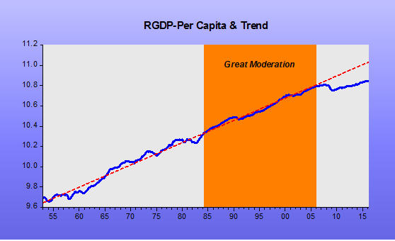
The typical post-WWII recession has a distinct trough, followed by a sharp rebound toward a stable trend line. Following the Great Recession, however, this rebound is missing. The missing recovery is what Summers (2016) and Eggertsson & Mehotra (2014) call ‘secular stagnation’ (see also Teulings and Baldwin 2014).

And show a version of this chart

holy-grail_1

Why did the dysfunction in credit markets impact the real economy for so long? Many explanations for the real effects have been advanced, and these are still being compared to data (e.g. Gertler and Kiyotaki 2010, Brunnermeier and Sannikov 2014, and Gourio 2012, 2013). Existing theories about why the crisis took place assume that the shocks that triggered it were persistent. Yet such shocks in previous business cycle episodes were not so persistent. This differential in persistence is just as puzzling as the origin of the crisis. What most explanations of the Great Recession miss is a mechanism that takes some large, transitory shocks and then transforms them into long-lived economic responses.

Perhaps the fact that this recession has been more persistent than others is because, before it took place, it was perceived as an extremely unlikely event. Today, the question of whether the financial crisis might repeat itself arises frequently. Financial panic is a new reality that was never perceived as a possibility before.

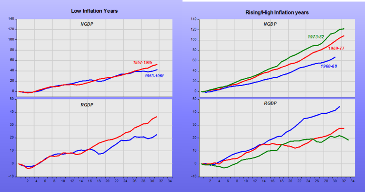
I believe there´s a simpler and more direct explanation – or mechanism – consistent with the changes in “beliefs, expectations or sentiment” which, in addition to helping understand the fall in productivity growth, is also consistent with the post war history of the behavior of RGDP depicted in the chart above.

That alternative explanation relies on observing that what is manifestly different in the present cycle is the behavior of monetary policy, if you understand monetary policy to be the main determinant of aggregate nominal spending (NGDP).

My strategy divides the post war period (actually the period after 1953, to avoid complications from the immediate post war years and the period of the Korean War) in four parts. The “low inflation” 1950s and early 1960s, the “rising-high inflation” of the late 1960s to the early 1980s, the “falling-low inflation” years from the mid-1980s to 2006, and the “Great Recession/Great Stagnation/Too Low Inflation” years thereafter.

In this story, it´s not “the tail that wags the economy”, but the “hydra-head” of the FOMC, who wields close control of aggregate nominal spending in the economy.

The panel depicts NGDP and RGDP during the four episodes. All corresponding charts have the same scale and they cover the period from the peak of the cycle to 28 quarters from the trough (which is the time span since the Great Recession ended in June 2009).

holy-grail_2

holy-grail_3

From looking at the behavior of NGDP and the associated behavior of RGDP during the episodes, it becomes clear why we´re living a Great Stagnation. For the past 60 years, monetary policy has never been this tight! That´s the mechanism that transforms transitory shocks into long-lived economic responses.

And on the productivity implications of inadequate AD growth, this was tweeted by Adam Tooze:

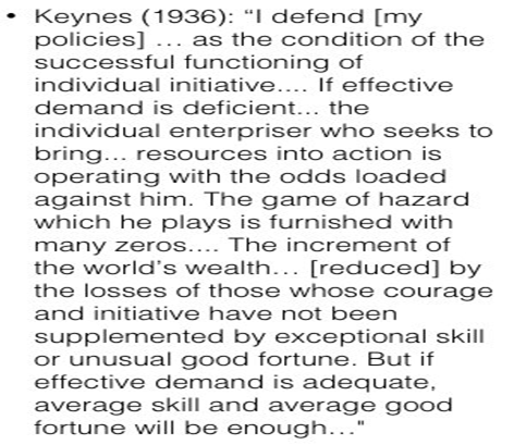
Keynes on the aggregate demand context necessary for rapid productivity growth
holy-grail_4

Europe overtakes US growth

A James Alexander post

It’s taken a while but the evidence is now in. Euro Area NGDP growth has overtaken US NGDP growth. Congratulations to the ECB, commiserations to the Fed. Go Europe!

ja-ez-us-growth_1

Sadly, it is not quite so simple. While the Fed has much to atone for letting NGDP drift so far off trend, the ECB has much more below trend growth to make up as the growth “gap” since the Great Recession makes very clear.

For those who prefer “Real” GDP, i.e. a real number GDP deflated by inflation, then we can also see a similar pattern of Europe overtaking the US.

ja-ez-us-growth_2

The main reason for this Euro Area relative resurgence is that monetary policy remains on a tightening bias in the US despite these terrible trends in Nominal and Real GDP, while the ECB is still very much in easing mode. The trends are equally visible in Base Money growth: 6% down YoY in the US, 30-40% up in the Euro Area.

The regional drivers of Euro Area growth are the big four countries who make up 75% of Euro Area GDP, while BeNeLux makes up a further 10%. Their report cards show:

  • Germany (29%) – NGDP slowed to 3.2% YoY in 2Q 2016 from a 3.6% trend over the last five quarters. It seems to have been driven by a fall in the deflator rather than RGDP growth which was stable at 1.7% YoY.
  • France (21%) – still growing at over 2% YoY NGDP doesn’t sound exciting but is very good for that country which has a terribly sluggish nominal economy hidebound by labor regulations and other restrictions. QoQ growth was 0%, which wasn’t too bad given the country had terror attacks and a major football championship keeping people away from the shops. Equally, keeping large parts of the labor force out of the economy as evidenced by its very low Labor Force Participation and Employment/Population ratios helps France´s productivity statistics but doesn’t make the country happy or grow very fast.
  • Italy (15%) – Despite the long-drawn out saga of the low nominal growth-inspired banking crisis, NGDP growth in Italy is above 2% for a second quarter running, helping keep RGDP positive YoY. ECB monetary policy is set for the average grower inside the Euro Area and Italy is very definitely average.
  • Spain (10%) – NGDP picked up after a 1Q2016 dip but did not regain the 4% recorded in 2H 2016. Still, it is very welcome given the political chaos engendered by not having a government and as the country has much catch up to do in terms of lost NGDP growth during the double dip recession.

Even writing these mini-report cards on various regions within the Euro Area, one feels very conscious that one is approaching the monetary area the wrong way. It is, or should be, seen as one bloc but the national politics keeps interfering. It mirrors the tension between the permanent Federal Reserve governors and the regional Fed presidents on the FOMC. The US is far more of a single market than the Euro Area but can still see tensions, especially when the central governors are two seats short due to nomination blocs by Congress on Presidential appointees.

Perhaps the sheer diversity of ECB council members strengthens the central officers in a way Janet Yellen can only dream. Who knows? But what is clear is that the ECB is on the right path at the moment while the Fed is not.

Shared misery is more comforting

This could only come from someone like Trichet:

Lackluster growth in the euro area is just as miserable as that seen in the U.S., the former president of the European Central Bank (ECB), told CNBC on Friday, defending the central bank’s policies.

“I would like to underline something that is not something well-perceived. I compared over the last 12 months real growth in the U.S. and real growth in the euro area and, to my great surprise, the euro area had growth of 1.6 percent over 12 months whereas in the U.S. it was 1.2 percent,” Jean-Claude Trichet told CNBC on the sidelines of the Ambrosetti forum.

“The euro area is, of course, posting growth which is totally insufficient but we share that insufficiency with the U.S…so we shouldn’t present growth in the euro areas as totally miserable. We share this misery with the other advanced economies in the current period,” he added.

Further arguing that:

Trichet defended the central bank’s track record, however, saying that it had done a “fantastic job” over a “very difficult time.”

Which, as the chart indicates, he made much more difficult!

Trichet´s Misery


The Great (Monetary) Unraveling

In “Years of Fed Missteps Fueled Disillusion with the Economy and Washington”, Jon Hilsenrath gives his contribution to the “Great Unraveling” series. He starts off writing:

In the past decade Federal Reserve officials have been flummoxed by a housing bubble that cratered the financial system, a long stretch of slow growth they failed to foresee and inflation persistently undershooting their goal. In response they engineered unpopular financial rescues, launched start-and-stop bond buying and delayed planned interest-rate boosts.

“There are a lot of things that we thought we knew that haven’t turned out quite as we expected,” said Eric Rosengren, president of the Federal Reserve Bank of Boston. “The economy and financial markets are not as stable as we previously assumed.”

In the 1990s, a period known in economics as the “Great Moderation,” it seemed the Fed could do no wrong. Policy makers and voters saw it as a machine, with buttons officials could push to heat or cool the economy as needed. Now, after more than a decade of economic disappointment, the central bank confronts hardened public skepticism and growing self-doubt about its own understanding of how the U.S. economy works.

For anyone seeking to explain one of the most unpredictable political seasons in modern history, with the rise of Donald Trump and Bernie Sanders, a prime suspect is public dismay in institutions guiding the economy and government. The Fed in particular is a case study in how the conventional wisdom of the late 1990s on a wide range of economic issues, including trade, technology and central banking, has since slowly unraveled.

During the Great Moderation, the Fed did do wrong. It just didn´t fail utterly! I believe the chart tells a convincing story.

Great Monetary Unraveling_1

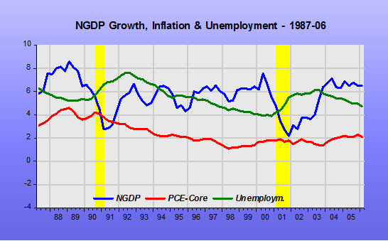
Note that during the Great Moderation – the Greenspan years – NGDP growth was relatively stable. In 1990-91, the story is the Fed engineered a “strategic Disinflation”, with inflation coming down from the 4% level to 2%. In 2000-02 the Fed, worried about the low (4%) rate of unemployment and what it would do to inflation, erred, allowing NGDP growth to fall significantly. This mistake was subsequently corrected.

In level terms we see that NGDP remained close to its “target level”.

Great Monetary Unraveling_2

In the first two years of his mandate, Bernanke managed to keep NGDP close to its “target level”. Inflation remained very close to target and unemployment low and stable.

Great Monetary Unraveling_3

The follow-up in 2008-09, however, was a disaster. The Fed allowed NGDP growth to take a beating. The result was a massive increase in unemployment (given wage stickiness) with inflation dropping below target.

Great Monetary Unraveling_4

This outcome is very closely linked to the Fed´s renewed obsession with the likelihood of inflation shooting up on the heels of an oil shock. This is somewhat surprising given that 10 years earlier, in 1997, Bernanke and co-authors had published a paper “Systematic Monetary Policy and the Effects of Oil Price Shocks” (now gated), which was summarized by Business Insider in March 2011, at the time the ECB was considering hiking rates because of the oil price rise.

Earlier we mentioned a Ben Bernanke paper from 1997 titled, Systematic Monetary Policy and the Effects of Oil Price Shocks and while the full thing is definitely worth a read, we have a breakdown for you right here.

CNBC is talking about it today, too, in light of the ECB’s talk of higher rates.

The thesis is that it is central bank monetary policy in reaction to oil price spikes that creates economic downturns, not the oil price spike itself.

On the other hand, a rate hike ends up causing problems for years, reducing output.

The implication of this is that Federal Reserve Chair Ben Bernanke has no interest in raising rate for a commodity or oil spike, so long as prices remain within Fed range, because it has a damaging impact on output that could send unemployment higher.

In 2008, however, the Bernanke Fed was very worried about the inflationary impact of oil. Although the Fed didn´t raise rates (they didn’t lower them either between April and September 2008), all the FOMC talk, as gleaned from the 2008 Transcripts, was about the risk of inflation and how the next rate move would likely be up!

“Fed talk” is monetary policy, and it gets transmitted through the expectations channel. You get the idea about how monetary policy was severely tightened during 2008, in addition to looking at the behavior of NGDP growth, that tanked, by looking at how the dollar strengthened, how the stock market plunged, and how long-term interest rates dropped.

Great Monetary Unraveling_5

In mid-2009 the economy began to recover, with NGDP growth reversing course. QE1 had a positive impact.

Great Monetary Unraveling_6

During this policy easing, the dollar fell while stocks and long-term bond yields rose.

Great Monetary Unraveling_7

For some reason, by mid-2010 the Fed decided that “enough was enough”. QE1 ended and NGDP growth was stabilized initially at 4%. In other words, unlike after the 2000-03 when NGDP fell below trend but was brought back to trend, this time around the Fed decided that a lower trend path was the way to go.

Great Monetary Unraveling_8

For the past two years, even with inflation remaining below target, through its raise hike talk the Fed has been tightening monetary policy. NGDP growth is coming down, the stock market has remained sideways while the dollar has boomed, oil prices have tanked and long-term bond yields are coming back down. It seems the Yellen Fed is guided by the unemployment rate.

Great Monetary Unraveling_9

It is, therefore, not surprising that the level chart for the Bernanke/Yellen period contrasts sharply with the one observed during the Greenspan years ( I would have imagined that would give useful pointers for the “design of a new monetary framework”)

Great Monetary Unraveling_10

The Jackson Hole Conference had an encouraging title: “Designing Resilient Monetary Policy Frameworks for the Future”. Unfortunately, they mostly talked about the nuts & bolts of policy implementation. Furthermore, while Yellen signalled one rate rise this year, her number 2 Stan Fischer said he “roots” for two. And Bullard said once in the next two years!

It was certainly a missed opportunity for the Fed to regain some modicum of credibility.

Yellen: “We will keep plodding”

In her opening remarks at Jackson Hole:

…my primary message today is that I expect monetary policy will continue to play a vital part in promoting a stable and healthy economy. New policy tools, which helped the Federal Reserve respond to the financial crisis and Great Recession, are likely to remain useful in dealing with future downturns. Additional tools may be needed and will be the subject of research and debate. But even if average interest rates remain lower than in the past, I believe that monetary policy will, under most conditions, be able to respond effectively.

Unfortunately, that is not happening. As illustrated in the charts, monetary policy has been overly tight, with a brief respite.

NGDP Saga

Why they don´t perceive this and make a real effort to overhaul the monetary policy framework is beyond comprehension!

The Fed Has Painted Itself Into A Corner? They Need A Helicopter Rescue

A Benjamin Cole post

Fed officials speak copiously and continuously about their unfulfilled urge for higher interest rates. This is a deep desire that U.S. central bankers were able to somewhat satiate from the early 1980s to 2008.

It is true that through much of the 1980-2008 period many Fed-rate increases led to lower inflation, and to weaker growth and sometimes recession, leading to lower interest rates. Rates were in long-term secular decline, but there were those euphoric passages (for central bankers) when rates could again be boosted, as during any economic recovery.

But, as Milton Friedman noted, 1) a central bank cannot tighten its way to higher interest rates forever, and 2) nominally low interest rates are a sign that money has been tight.

A couple generations of money-tightening has produced predictable results of low interest rates, low growth, as well as miniscule inflation.

The Fed is presently trapped. The central bank has little grip on long-term rates, now near historic lows. So raising the Fed funds rate and interest on excess reserves (IOER), will only dampen long-term rates again, the opposite of what the Fed says it wants.

IOER

And then there is the tar baby the Fed tossed into the corner into which it then painted itself: IOER.

Banks make money “on the spread,” that is the difference between borrowing costs and lending returns, usually about 300 basis points. Banks have overhead, labor costs, fancy HQs so that spread gets cut thin on the way to the bottom line.

But now banks collect 0.50% on IOER, the same reserves hugely swollen by QE. The Fed is eager to boost that to 0.75% soon, and possibly even higher in the 12 months ahead.

At some point it will make sense to banks to do nothing.

IOER may be one reason why U.S. commercial real estate loan volume only reached 2007 levels again in late 2015. Actually, 2016 has been a decent year for commercial real estate loan volume—finally eclipsing 2007 levels—but if the Fed raises IOER again, perhaps the IOER will be higher than the profit on a commercial property loan. The banks can go golfing on the 0.75% they make for keeping money in the vault.

Nirvana for central and commercial bankers at last!

Yet this problem of IOER-addled banks is doubly important, as many say it is banks that expand the money supply, when they extend a loan. Before QE, the main creation of new money was through bank lending, and banks primarily lend on real estate.

This gets into the whole exogenous v. endogenous expansion of the money supply dispute, which can put any sane person into knots for days.

But suffice it to say, the Fed is following a reckless and suppressive mission with a view towards higher IOER. The money hose could run dry long before the Fed could arrange tools to replenish the supply.

Paying banks to do nothing is an imprudent and dangerous precedent, and of course, only banks will closely monitor and lobby this IOER issue going forward. Like any federal dope, it will quickly become addictive.

Conclusion

The Fed likely should have never paid IOER.  But what is done is done. This makes the quantitative easing (QE) option going forward more problematic, as banks will accrue even more indolence-inducing reserves.

But the US will enter recession again someday, and likely with interest rates near or lower than today’s levels.

Really, the only recourse is to the helicopters. And that begs the question: Why wait until there is a deep recession again? How about preventative air drops anytime core-PCE dips below 2% YOY?

Or, better yet, whenever NGDP growth drops below 5%?

“Full Employment” is (supposedly) all around us!

For example:

Indeed, Alex Tabarrok, an economist at George Mason University, argues that it’s “crazy” to believe that a lack of demand explains the slow recovery.

The time period in which monetary policy would have been effective is long over,” he says.

Once an economy reaches full employment, he argues, there’s no way for increased spending to boost economic output — you’d just get more inflation instead. And the US unemployment rate is currently 4.9 percent, near historic lows, a sign that a shortage of demand might not be a problem right now.

Or

Mark Zandi, chief economist of Moody’s Analytics, said, “Job growth remains strong, but is moderating as the economy approaches full employment. Businesses are having a more difficult time filling open job positions, which are near record highs. The nation’s biggest economic problem will soon be the lack of available workers.”

Unfortunately, “full employment” is a very imprecise and elusive concept. More than 50 years ago, Arthur Okun came up with the tongue-twisting concept of “full employment rate of unemployment” (Also called NIRU, or “Noninflationary Rate of Unemployment”, which then became NAIRU – Non Accelerating Inflation Rate of Unemployment). At the time he pinned it at 4% (but imagined it could be lower). The pursuit of that idea ended up throwing the economy into the “Great Inflation”! Over time the “concept-number” has varied a lot, mostly being pinned between 5% and 7%. It´s a Phillips-Curve based concept, relating unemployment to inflation.

In other to have a better handle of the meaning of “full employment” at present, I compare two episodes during which the prevalent view was one that the economy was at “full employment”. The present (2012 – 2016) and during 1993 – 1997. To do that I put up a set of charts contrasting the two “full employment” periods.

The first chart shows that both then and now, the rate of unemployment was falling and, as then, the unemployment rate has fallen below 5%.

Full Employment_1

Observe that in the earlier period, falling unemployment went along with inflation declining, while at present inflation has remained low throughout. According to the Okun concept, therefore, we have not yet reached “full employment”.

Full Employment_2

Going deeper, the rate of unemployment is determined by two factors, the share of the population which is employed, the Employment Population Ratio (EPOP), and the “desire” of people to participate in the labor force, the Labor Force Participation Rate (LFPR). The unemployment rate, u, is then calculated as 1-(EPOP/LFPR). Therefore, the higher the EPOP, all else equal, the lower the unemployment rate, u, and the higher the LFPR, all else equal, the higher the rate of unemployment will be.

The charts show the behavior of those two factors during the two periods.

Full Employment_3

Their behavior is very different. While in the earlier period, EPOP was higher and generally rising, more recently it is much lower and relatively flat. When you look at the LFPR, in the earlier period it was higher and also generally rising, more recently it is much lower and clearly falling.

Both the EPOP and LFPR are determined, on the one hand by what we may call the “attractiveness” of the labor market. If jobs are plentiful and varied, if barriers to employment (things like occupational licensing) are low, the EPOP will be high, and so will the LFPR. Stable and robust aggregate demand (NGDP) growth is certainly a determining factor.

As we saw, if the LFPR rate falls, given EPOP, the rate of unemployment will fall. Note that in 1993-1997, the rise in LFPR was more than compensated by the increase in EPOP, making for a declining rate of unemployment. At present, the picture is very different, with a declining LFPR facing a relatively flat EPOP. Although the result is the same, a falling u, we may not necessarily be content with the outcome.

If the outcome at present is the result of a lack of job opportunities (low “attractiveness” of the labor market), we should not be happy and call the situation one of “full employment”. However, there may also be structural reasons for the fall in the LFPR. Those reasons would be the result of long-run trends, such as baby boomers beginning to retire.

In short, those that say the economy is at present at “full employment”, implicitly are saying that the structural factors dominate the fall in the LFPR. But, is that a reasonable assumption?

I don´t believe it is so. Structural factors don´t “summersault”, shock-like, they accrue, slowly.

The charts below, however, show that EPOP and the LFPR changed shock-like, coinciding with the steep plunge in NGDP growth.

Full Employment_4

The next chart indicates that the robustness of aggregate demand (NGDP growth) helps explain the state of the labor market: “Attractive” in the earlier period and “Unattractive” at present. In that case, the lion´s share of the drop in the LFPR would be due to cyclical reasons.

Full Employment_5

If that´s true, the present state is not one of “full employment” because the number of “missing workers” (workers who would be in the labor market if “attractiveness” were high) would be substantial, so “full employment” would not be an acceptable characterization of the present  economic environment.

Paraphrasing the populist candidate: “Make this Recovery Robust”!

The Reserve Bank of Australia is becoming ‘conventional’

Today:

The Reserve Bank of Australia has lowered the cash rate to 1.5% in an effort to stimulate growth, boost inflation and encourage a fall in the Australian dollar.

The cut of 25 basis points from 1.75% is the last decision from outgoing RBA Governor Glenn Stevens. In a statement on the rate decision he says:

“Low interest rates have been supporting domestic demand and the lower exchange rate since 2013 is helping the traded sector. Financial institutions are in a position to lend for worthwhile purposes.”

In addition:

In his statement, Glenn Stevens also addressed the concerns around Australia’s property market. He noted Australia’s banks have been cautious in lending to certain sectors like the property market and despite the possibility of a considerable supply of apartments emerging over the next few years, lending for housing has slowed this year.

It seems the RBA has ‘unlearned’ the lessons of 2008. Then it did not suffer a recession because, contrary to what most major central banks, it did not allow NGDP to tank.

What supported domestic demand was an adequate monetary policy that kept spending growing close to a stable trend path. Maybe because of worries about house prices, monetary policy has been overly tight for the past two years, despite the drop in the policy interest rate.

Australia Aug16_1

Australia Aug16_2

Australia´s monetary policy statement says:

In determining monetary policy, the Bank has a duty to maintain price stability, full employment, and the economic prosperity and welfare of the Australian people. To achieve these statutory objectives, the Bank has an ‘inflation target’ and seeks to keep consumer price inflation in the economy to 2–3 per cent, on average, over the medium term.

The chart shows that since 1992, when the target was set, inflation has averaged 2.5%. The RBA couldn´t have done better! Soon we´ll hear Steven Williamson say “Told you so; interest rates are falling and so is inflation. If rates continue to fall and remain low, you´ll get deflation”!

Australia Aug16_3

If only the RBA had continued to pay attention to NGDP!

The chart shows that the house price boom ended, without tears, more than 10 years ago.

Australia Aug16_4

The Fed is failing: US NGDP growth crash

A James Alexander/Marcus Nunes post

US RGDP surprisingly disappointed today with just 1.2% QoQ annualised growth and, coincidentally, 1.2% YoY growth too. A lot of the weakness in real growth was due to perhaps noisy factors like inventories. However, even final sales are weakening. Household spending (PCE-Personal Consumption Expenditure) was also nothing exciting on a YoY basis at just 3.7%. Investment growth is now in negative territory.

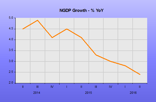
The main story of today’s release is the horrible NGDP growth print for 2Q. The trend is even worse than we have been worrying about. The second quarter YoY growth rate was a mere 2.4%. This is well below the near 3% being seen in the supposedly sick Euro Area.

The charts indicate very clearly that since mid-2014, when the Fed began the on-off rate hike talk, nominal trends have been down. RGDP growth simply cannot blossom in such an environment.

JA Fed Failing_1

JA Fed Failing_21

JA Fed Failing_2

JA Fed Failing_3

JA Fed Failing_4

US slower real growth than France

Many were laughing about the 2Q RGDP figure for France today, but at 1.4% YoY it has grown faster than the US for the last 12 months. The Euro Area as a whole did better than France, growing 1.6% YoY in the second quarter.

This isn’t a complete surprise to us who have been pointing out the better news from the  Euro Area for some time. The reason is that monetary policy is so much easier in the Euro Area than the US. The ECB is on the front foot with Base Money growing at 40%+ a year versus negative 5% per year in the US.

UK NGDP picks up ever so slightly

A James Alexander post

UK RGDP in 2Q 2016 surprised on the upside today with 2.2% annual growth. NGDP also picked up a bit to 2.9%, but is still well below trend.

The numbers are only a first estimates, and there has been some funny business with a usually strong April following a very weak March. In any case no-one is that interested in 2Q as it is all pre-Brexit. No-one will be that interested in 3Q probably either as it will be influenced by the shock of the Brexit vote.

JA UK NGVA4

We are also not that interested in RGDP as it is such a low quality number, based on the neglected numbers that go to make up NGDP and the low quality GDP deflator figure that, like CPI, struggles to cope with qualitative and structural change.

NGDP in the UK has been horribly weak for the prior four quarters. The proxy number for NGDP, Nominal GVA, has been even weaker at a less than 2% average over the last four quarters. While the 2Q 2016 figure of 2.9% is better than the recent past it is still far below a healthy level. Only NGDP growth and hence wage growth of around 5% will allow real incomes to show a good diversity of outcomes and thus promote flexibility and productivity growth. Real wages are still squashed down into a narrow range of growth by this nominal sluggishness.

A top priority for the new Chancellor of the Exchequer is to give the Bank of England nominal growth targets for the good of the economy overall and for healthy tax receipts in particular.

Higher nominal growth will also enable the UK labour market to cope with (potential) shocks from things like Brexit, allowing aggregate negative real wage growth without having to go through job and wealth destroying process of aggregate negative nominal wage growth.