The scourge of the “star Trinity”

The trinity is comprised of the “star variables” y*, u*, and r*, which denote, respectively, potential output, natural rate of unemployment and neutral interest rate.

According to Bernanke:

Changes in policymakers’ estimates of these variables thus reflect reassessments of the economic environment in which policy must operate.

DeLong is more forceful:

The only way to resolve the question in a satisfying way is to test it: to push the economy beyond the estimated potential growth rate and see if inflation rises…. Bernanke argues that Fed officials are willing to be a little patient with the economy, to see whether running it a little hot brings more workers into the labour force and encourages productivity-enhancing investments. It certainly seems clear to me that overshooting is the right way for the Fed to err….

But I am less confident than Mr Bernanke in the Fed’s openness to overshooting. It did not exactly intend to run the unemployment rate experiment that demonstrated how wrong its previous projections had been…. Now, the Fed looks all too willing to revise down its GDP growth projections without ever really testing them…. There is far too little radicalism at the Fed. It risks making permanent a low-growth state of affairs which is largely a consequence of its own excessive caution.

It gets worse. In “Fed Officials Challenge Decades of Accepted Wisdom on Inflation”, we read:

Nalewaik suggests that a return to a world in which inflation expectations and actual inflation become more tightly linked, as they were before the mid-1990s, may not be in the cards.

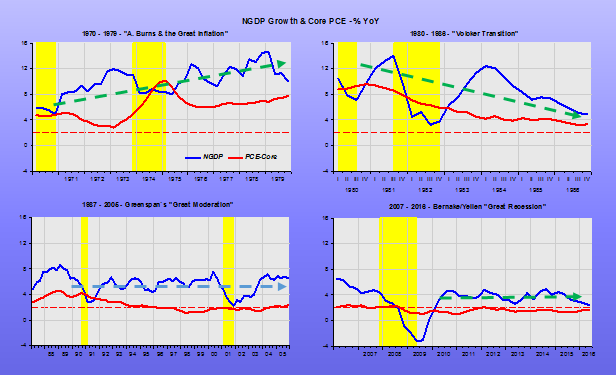
As Nick Rowe tweeted, if the Fed´s inflation target is credible, as it has been for more than 20 years, there should be no correlation between expected and actual inflation. This is an application of Friedman´s “Thermostat”. In 2003, Friedman gave the simplest explanation for the “Great Moderation” with his “thermostat analogy”. In essence, the new found stability was the result of the Fed (and many other Central Banks) stabilizing nominal expenditures. In that case, from the QTM, according to which MV=PY, the Fed managed to offset changes in V with changes in M, keeping nominal expenditures, PY, reasonably stable. Note that PY or its growth rate (p+y), contemplates both inflation and real output growth, so that stabilizing nominal expenditures along a level growth path means stabilizing both inflation and output.

The thermostat analogy come out very clearly in the panel below.

Star Trinity

While monetary policy was loose and NGDP growth was trending up, the outcome was runaway inflation.

To get inflation down, Paul Volcker experimented with NGDP growth, bringing it down.

While the Greenspan Fed kept NGDP growth at an adequate stable level, the Bernanke/Yellen Fed first depressed NGDP and then kept it growing at an inadequate level. That fact is sufficient to explain both the “sluggish” recovery and “too low” inflation.

If only the Fed could forget about the “star trinity” and experiment with NGDP growth, the main determinant of the economic environment…

Instead, they get “desperate

Central bankers and governments must come up with new policies to buffer their economies against persistently low interest rates that threaten to make future recessions deeper and more difficult to avoid, a top Federal Reserve official said on Monday.

Setting higher inflation targets, tying monetary policy directly to economic output, instituting government spending programs that automatically kick in during economic downturns, and boosting investment in education and research are all policies that should be considered, San Francisco Fed President John Williams said.
When the Fed killed growth

Neil Irwin writes “We’re in a Low-Growth World. How Did We Get Here?”:

One central fact about the global economy lurks just beneath the year’s remarkable headlines: Economic growth in advanced nations has been weaker for longer than it has been in the lifetime of most people on earth.

This slow growth is not some new phenomenon, but rather the way it has been for 15 years and counting. In the United States, per-person gross domestic product rose by an average of 2.2 percent a year from 1947 through 2000 — but starting in 2001 has averaged only 0.9 percent. The economies of Western Europe and Japan have done worse than that.

His “Tell-Tale” evidence comes from this chart

Fed Killed Growth_1

He certainly could have done a better reading of the evidence. First of all, the very high (but falling) average growth, especially in Europe and Japan before 1980, is a reflection of the catch-up growth following the end of WWII. This can be clearly seen by comparing real per capita output in Japan and the US from 1950 onwards shown in the chart.

Fed Killed Growth_2

By the early 1970s, Japan´s catch-up growth petered out. After 1990, per capita growth almost completely disappeared. In Irwin´s chart we see 10-year average annual growth in Japan falling off steeply.

Meanwhile, observe that per capita growth in the US and Europe during the period between the two vertical bars (“Great Moderation”) is very stable and only falls off fast with the onset of the “Great Recession”. In that sense, the low per capita growth phenomenon is “new”.

What happens when we look at real per capita growth for a long span of time. For the US the table gives the summary statistics for growth over 1850 to 2015.

1850 – 2006 1985 – 2006 2009 – 2015
Mean=2.1% Mean=2.1% Mean=0.6%
St Dev=4.9 St Dev=1.2 St Dev=1.9

During the Great Moderation (1985 – 2006) real per capita growth was the same as the previous 156 years, but growth volatility (Standard Deviation) was lower by a factor of 4, a much more “pleasant” life experience. During the recovery that began 7 years ago, it is growth itself that was reduced by a factor of almost 4.

At times during the long period of 2.1% growth, we observe periods of deep penury. For example, in 1934, in the midst of the Great Depression, the average annual 10-year per capita growth reached a minimum of -0.9%!

Then, that was the result of a massive monetary error. You wouldn´t be off to conclude that the steep drop in per capita growth at present is also the result of a less massive, but more persistent monetary error. From looking at Irwin´s chart, it almost looks like “everyone wants to be Japan”, a risk Bernanke himself warned about as far back as 1999.

Bullard makes sense, but misses the vital “ingredient”

In “The St. Louis Fed’s New Characterization of the Outlook for the U.S. Economy”, Bullard states:

It is a good time to consider a regime-based conception of medium- and longer-term macroeconomic outcomes. Key macroeconomic variables including real output growth, the unemployment rate, and inflation appear to be at or near values that are likely to persist over the forecast horizon.

Any further cyclical adjustment going forward is likely to be relatively minor. We therefore think of the current values for real output growth, the unemployment rate, and inflation as being close to the mean outcome of the “current regime.”

Of course, the situation can and will change in the future, but exactly how is difficult to predict. Therefore, the best that we can do today is to forecast that the current regime will persist and set policy appropriately for this regime. If there is a switch to a new regime in the future, then that will likely affect all variables—including the policy rate—but such a switch is not forecastable.

What´s missing is the acknowledgement that the “current (or any) regime” is the result of Fed decisions. In that case, if “further cyclical adjustment going forward is likely to be relatively minor” is mostly because the Fed is perfectly happy with the current regime.

The panel below “defines” three “regimes”: The “Great Moderation” regime, the “Great Recession” regime and the “Depression” regime. While Bullard (who changes views much more often than the other FOMC members) is content with the “Depression” regime, many of the others, by constantly talking “rate hikes”, are fliting with a change to a “Deeper Depression” regime!

Bullard States

In level terms:

Bullard States_1

Update: Ryan Avent agrees:

If the global real interest rate is in the neighbourhood of 0% and expected inflation is in the neighbourhood of 1%, that suggests the Fed will have an extremely difficult time raising nominal interest rates beyond 1%. Mr Bullard has the regime right, but the causation wrong. The Fed has driven the economy into this rut in its determination to keep inflation low.

“The Way We Were”

Antonio Fatás writes “The missing lowflation revolution”:

It will soon be eight years since the US Federal Reserve decided to bring its interest rate down to 0%. Other central banks have spent similar number of years (or much longer in the case of Japan) stuck at the zero lower bound. In these eight years, central banks have used all their available tools to increase inflation closer to their target and boost growth with limited success. GDP growth has been weak or anemic, and there is very little hope that economies will ever go back to their pre-crisis trends…

… Now we have learned that either all central bankers are as incompetent as the Bank of Japan in the 90s or that the phenomenon is a lot more natural, and likely to be repeated, in economies with low inflation, more so when the natural real interest rates is very low…

My own sense is that the view among academics and policy makers is not changing fast enough and some are just assuming that this would be a one-time event that will not be repeated in the future (even if we are still not out of the current event!).

The comparison with the 70s when stagflation produced a large change in the way academic and policy makers thought about their models and about the framework for monetary policy is striking. During those years a high inflation and low growth environment created a revolution among academics (moving away from the simple Phillips Curve) and policy makers (switching to anti-inflationary and independent central banks). How many more years of zero interest rate will it take to witness a similar change in our economic analysis?

Fatás succinctly lays out the problem. Interestingly, since the late 1990s, many have been concerned about “Monetary Policy in a Low Inflation Environment”, among them, Bernanke himself! For those interested, I provide a nontechnical essay from 2001 (with references within).

Apparently, when “push comes to shove”, it was all forgotten!

For the past seven years, Market Monetarists, under the guidance of Scott Sumner have proposed a monetary regime change. The new regime would have the Fed (and other central banks) level target nominal GDP.

In a sense, this proposal simply involves making explicit something that was only implicit during the “Great Moderation”, being, in fact, responsible for that outcome. That´s good, because it won´t be a “shot in the dark”. We´ve been there.

Over the past seven years, people who never thought themselves as “market monetarists” have come out in favor. For example, Christina Romer, a former Obama head of the CEA and Harvard professor Jeffrey Frankel. Even Simon Wren-Lewis, a pillar of the New Keynesian school, is coming around to the idea.

There is however, one lose end. There´s a view that over the past five years, after partially recouping from the “Great Slump”, the economy lives through a “Great Moderation 2.0”. Unfortunately, the “GM 2.0” is also viewed as the “Great Stagnation”.

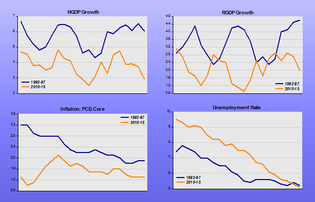
This is where the “Level Target” attached to “NGDP Targeting” comes in. To make the idea clear, I put up a set of charts that compare the “golden age” of the “GM 1.0”, the five years from 1992.IV to 1997.IV with the five years of the “GM 2.0”, from 2010.III to 2015.III.

Level Problem_1

Houston, we have a LEVEL problem!

Another point: Fatás mentions the change among academic economists, who moved away from the Phillips Curve. Now, we have academics in the Fed, like Yellen and Fischer, moving back to Phillips Curve thinking, while not abandoning inflation targeting.

Note that the unemployment rate at present is the same low rate of unemployment as in 1997, while inflation, both in 1997 and today are below the target level. In both instances, unemployment fell together with inflation!

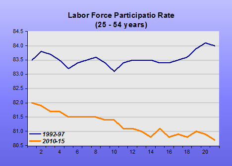
However, the unemployment then and now are not comparable magnitudes. Just look at the very different behavior of labor force participation in the two periods.

Level Problem_2

Although the level of NGDP growth is important, the fundamental level question concerns the level of NGDP, more than its growth rate. This comes out shockingly clear in the next chart. As Fatás mentions in his post:

The fact that a crisis can be so persistent and that cyclical conditions can have such large permanent effects on potential output.

Would lead us to say that, after 7 years, the original trend may not be attainable any longer. However, a trend level between today´s level and the level that prevailed all the way to 2007 may be feasible.

Level Problem_3

The way we were


Australia tries to find “balance”

Being one of the very few countries (two others are Poland and Israel) whose monetary policy managed to avoid a recession on the heels of the 2008-09 crisis, Australia is a natural object of Schadenfreude!

Two recent articles “wish harm” on Australia

1 Is Australia Sliding Into Recession?

Recent data prompt economists to warn Australia may be ripe for first recession in 24 years

2 Goodbye to the lucky country

What if our economic growth stalls altogether? Worse still, what if we slip into recession?

These are not farcical questions. Figures released this week recording just 0.2 per cent growth in Gross Domestic Product for the June quarter, and just 2 per cent for the year to June, were extremely weak. Indeed, without a one-off increase in government defence spending, the quarter would have recorded zero growth.

There´s as usual some luck involved. In the case of Australia, it did no harm that immediately before the crisis hit, it was effecting an “excessively” expansionary monetary policy, as indicated by NGDP growth and it´s level relative to the trend path. The two charts illustrate.

Australia tries for balance_1

Australia is the prototype commodity exporting country. In such cases, the exchange rate should move to offset commodity price or terms of trade changes. That´s what´s reflected in the next chart, with two notable exceptions. In 2004-07, the exchange rate doesn´t move, while commodity prices are rising. That boils down to an expansionary monetary policy. In the first set of charts that is reflected in the upward trend taken by NGP growth and the rise in NGDP above trend.

Australia tries for balance_2

In 2001-13, the RBA tightened policy. That is implied by the fact that falling commodity prices were not accompanied by a depreciation (fall) in the A$ relative to the dollar. In the first set of charts, we observe a strong fall in NGDP growth.

We note that NGDP growth has done a lot of “swinging” after the crisis hit. Scott Sumner thinks that the RBA has “chosen” a lower growth rate for NGDP. That may be right, and I put that new trend growth at 4%. If that´s correct, we may soon find Australian NGDP growth settling around that level, implying that NGDP will evolve close to a level path that will be below the previous one.

There´s, however, always the risk that the RBA, if it starts worrying about debt levels and house prices, will make the mistake the Riksbank made in 2010. Let´s hope that doesn´t occur!

Update: In Australia, the post crisis “NGDP growth swings” are reminiscent of the “Volcker NGDP growth swings”. What Volcker was trying to do was find a stable path for NGDP. That was “bequeathed” to Greenspan, and the “Great Moderation” ensued, until Bernanke lost it!

Australia tries for balance_3

What the Fed wants, the Fed gets!

With the GDP revision today:

Broadly, economists expect the economy will strengthen later in the year, but it remains to be seen if growth can breakout of its about 2% pattern recorded for most of the economic expansion that began in mid-2009. Even a rebound to a 3% growth rate in the second quarter would still result in a sluggish expansion for the first half of the year.

The concept of “strengthen” is vague in the context. And there´s nothing to indicate that “growth will breakout of the close to 2% recorded pattern”.

The charts give a good visual.

In the first, I blocked out the (extended) Great Recession period. Note how nominal and real growth have come back at reduced speeds, which I named “Depressed” Moderation to contrast with the “Great” Moderation that took place from 1987 to 2007.

What the Fed wants_1

In the levels chart below, you can see how the economy has been “downgraded” to the “Depressed” Moderation. The important thing to note is that that´s exactly where the Fed wants it to be. If that´s true, there´s no chance the economy will brakeout of the “recorded pattern”.

What the Fed wants_2

Maybe that´s optimistic, because it appears the Fed has set its sights lower:

Federal Reserve officials forecast the economy to grow between 1.8% to 2.0% all this year, according to projections released earlier this month. That would represent a slowdown from the 2014 rate.

Note: The Fed knows what it wants!