“Full Employment” is (supposedly) all around us!

For example:

Indeed, Alex Tabarrok, an economist at George Mason University, argues that it’s “crazy” to believe that a lack of demand explains the slow recovery.

The time period in which monetary policy would have been effective is long over,” he says.

Once an economy reaches full employment, he argues, there’s no way for increased spending to boost economic output — you’d just get more inflation instead. And the US unemployment rate is currently 4.9 percent, near historic lows, a sign that a shortage of demand might not be a problem right now.

Or

Mark Zandi, chief economist of Moody’s Analytics, said, “Job growth remains strong, but is moderating as the economy approaches full employment. Businesses are having a more difficult time filling open job positions, which are near record highs. The nation’s biggest economic problem will soon be the lack of available workers.”

Unfortunately, “full employment” is a very imprecise and elusive concept. More than 50 years ago, Arthur Okun came up with the tongue-twisting concept of “full employment rate of unemployment” (Also called NIRU, or “Noninflationary Rate of Unemployment”, which then became NAIRU – Non Accelerating Inflation Rate of Unemployment). At the time he pinned it at 4% (but imagined it could be lower). The pursuit of that idea ended up throwing the economy into the “Great Inflation”! Over time the “concept-number” has varied a lot, mostly being pinned between 5% and 7%. It´s a Phillips-Curve based concept, relating unemployment to inflation.

In other to have a better handle of the meaning of “full employment” at present, I compare two episodes during which the prevalent view was one that the economy was at “full employment”. The present (2012 – 2016) and during 1993 – 1997. To do that I put up a set of charts contrasting the two “full employment” periods.

The first chart shows that both then and now, the rate of unemployment was falling and, as then, the unemployment rate has fallen below 5%.

Full Employment_1

Observe that in the earlier period, falling unemployment went along with inflation declining, while at present inflation has remained low throughout. According to the Okun concept, therefore, we have not yet reached “full employment”.

Full Employment_2

Going deeper, the rate of unemployment is determined by two factors, the share of the population which is employed, the Employment Population Ratio (EPOP), and the “desire” of people to participate in the labor force, the Labor Force Participation Rate (LFPR). The unemployment rate, u, is then calculated as 1-(EPOP/LFPR). Therefore, the higher the EPOP, all else equal, the lower the unemployment rate, u, and the higher the LFPR, all else equal, the higher the rate of unemployment will be.

The charts show the behavior of those two factors during the two periods.

Full Employment_3

Their behavior is very different. While in the earlier period, EPOP was higher and generally rising, more recently it is much lower and relatively flat. When you look at the LFPR, in the earlier period it was higher and also generally rising, more recently it is much lower and clearly falling.

Both the EPOP and LFPR are determined, on the one hand by what we may call the “attractiveness” of the labor market. If jobs are plentiful and varied, if barriers to employment (things like occupational licensing) are low, the EPOP will be high, and so will the LFPR. Stable and robust aggregate demand (NGDP) growth is certainly a determining factor.

As we saw, if the LFPR rate falls, given EPOP, the rate of unemployment will fall. Note that in 1993-1997, the rise in LFPR was more than compensated by the increase in EPOP, making for a declining rate of unemployment. At present, the picture is very different, with a declining LFPR facing a relatively flat EPOP. Although the result is the same, a falling u, we may not necessarily be content with the outcome.

If the outcome at present is the result of a lack of job opportunities (low “attractiveness” of the labor market), we should not be happy and call the situation one of “full employment”. However, there may also be structural reasons for the fall in the LFPR. Those reasons would be the result of long-run trends, such as baby boomers beginning to retire.

In short, those that say the economy is at present at “full employment”, implicitly are saying that the structural factors dominate the fall in the LFPR. But, is that a reasonable assumption?

I don´t believe it is so. Structural factors don´t “summersault”, shock-like, they accrue, slowly.

The charts below, however, show that EPOP and the LFPR changed shock-like, coinciding with the steep plunge in NGDP growth.

Full Employment_4

The next chart indicates that the robustness of aggregate demand (NGDP growth) helps explain the state of the labor market: “Attractive” in the earlier period and “Unattractive” at present. In that case, the lion´s share of the drop in the LFPR would be due to cyclical reasons.

Full Employment_5

If that´s true, the present state is not one of “full employment” because the number of “missing workers” (workers who would be in the labor market if “attractiveness” were high) would be substantial, so “full employment” would not be an acceptable characterization of the present  economic environment.

Paraphrasing the populist candidate: “Make this Recovery Robust”!

Déjà Vu, and one of the World´s Great Coincidences

We´ve had, in 2016, a continuation of the ‘guessing game’ about when (the month) the FOMC will once again raise rates.

The year started off with Vice Chair Stanley Fischer ‘promising’ four rate hikes during the year. Subsequently, with incoming less than stellar data, that number has been reduced to 3, 2-3 and more recently ‘just’ 2.

As soon as the weaker than expected labor data was released on Friday, ‘bets’ for a June rate hike fell steeply.

Actually, the unemployment rate, which stood pat at 5%, was the result of two offsetting negatives: the small drop in the Population/Employment ratio, which all else equal would increase the unemployment rate, was just offset by the also small fall in the Labor Force Participation rate (LFPR), which all else equal would cause a decrease in the unemployment rate.

Interestingly, regarding the LFPR, we often hear that “a large portion of the decline in the LFPR in this cycle is due to demographics”.

The coincidence of the ‘demographic factor’ with the first large drop in nominal spending (aggregate demand or NGDP) since 1937 must surely be one of the world’s great coincidences!

Great Coincidence

In effect, reducing monetary policy to a ‘guessing game’ about the timing of the next rate hike just shows the ‘poverty’ of present day macro and monetary analysis. No wonder a “Great Stagnation” is the “winning paradigm”!

A “strong” employment report in a “weak” economy?

The headline numbers for February: 242 thousand jobs and 4.9% unemployment rate.

Let´s give these numbers some “structure”. The unemployment rate is the result of two forces that reflect economic decisions by individuals and firms. The first is the employment population ratio (EPOP). The second the labor force participation ratio (LFPR). The unemployment rate is equal to 1-(EPOP/LFPR).

The charts show the behavior of unemployment together with its two determinants over the three most recent cycles. The first two (1990, 2001) happened during the “Great Moderation”, while the third (2007) takes place during the “Depressed Great Moderation”.

Employ Report 02-16_1

The green bars denote recessions (as determined by the NBER). The yellow bars denote periods of falling unemployment.

A “healthy” fall in unemployment occurs simultaneously alongside a “strong” rise in EPOP and a “moderate” rise or stable LFPR.

In the present cycle, the fall in unemployment reflects a stable and then “moderate” rise in EPOP and a falling LFPR. It´s another “animal” altogether!

Many say that this reflects mostly structural/demographic changes, like baby-boomers’ retirement. The coincidence in time of the structural/demographic factors with the onset of the “Great Recession” that witnessed the largest drop in nominal spending (NGDP) since 1937 is “too much to swallow”. More likely strong cyclical factors were responsible for bringing forward in time decisions that otherwise would have taken place over the next several years. In this sense the problem is mostly “cyclical”.

Although the economy is still adding jobs at a rate that could be called “healthy”, the relatively low quit rate (which tends to rise when employment opportunities are “bountiful”), the relatively high duration measures of unemployment (indication that opportunities are not “bountiful”) and the relatively weak (if you take into consideration the depth of the employment drop) job growth, indicate that the labor market is some distance away from having fully recovered. In other words, like the economy, it´s still weak!

More evidence on the “special” nature of the present (2007-) cycle.

We start with the chart for NGDP (peak to peak over the cycles)

Employ Report 02-16_2

The 1990 and 2001 cycles are, except for length, identical. The present cycle suffers from lack of spending.

That´s mirrored in the behavior of RGDP

Employ Report 02-16_3

Now, when you look at the behavior of employment, the 2001 cycle shows a “surprising” result. From the behavior of NGDP and RGDP one would expect it to also mirror what happened in the 1990 cycle.

Employ Report 02-16_4

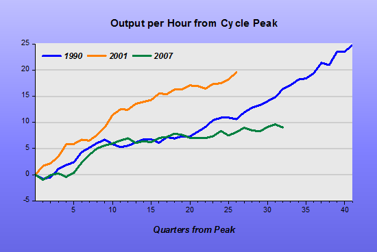
But when you look at the behavior of productivity, the employment difference becomes understandable. The 2001 cycle was “productivity rich”.

Employ Report 02-16_5

The present cycle, on the other hand is both “employment poor” and “productivity poor”. In addition, it is also “price & wage poor”

Maybe it´s not farfetched to associate much of the overall “poorness” of the present cycle to the sorry state of nominal spending, i.e. aggregate demand!

The Fed & the Unemployment Rate

Yellen on labor market (Sept 2015):

As I said, although we’re close to many participants and the median estimate of the longer-run normal rate of unemployment, at least my own judgment – and this has been true for a long time – is that there are additional margins of slack, particularly relating to very high levels of part-time involuntary employment, and labor force participation that suggests that at least to some extent the standard unemployment rate understates the degree of slack in the labor market.

“But we are getting closer. The labor market has improved. And as I’ve said in the past we don’t want to wait until we’ve fully met both of our objectives to begin the process of tightening policy given the lags in the operation of monetary policy.”

In fact, she´s a long way from meeting both objectives! No one has any doubt about the distance we are from the 2% inflation target. On the other hand, with unemployment down to 4.9%, many could assume that we´re even “overstepped” it!

The best way to look at the unemployment rate is to analyze it from the perspective of its two constituents: The employment population ratio (EPR) and the labor force participation rate (LFPR).

That´s because the unemployment rate (UR) is, by definition, equal to [1-(EPR/LFPR)]*100. Therefore, a rise in the EPR, normally associated with a robust economy, will reduce the unemployment rate. On the other hand, a rise in the LFPR, something also usually associated with a growing economy (controlling for demographic factors, that change slowly), will increase the unemployment rate.

From this perspective, even in a strong economy the rate of unemployment could be rising (a little at least) if the rise in LFPR is higher than the rise in the EPR.

The charts below make the importance of looking at the rate of unemployment together with its determinants clear.

In the “Golden 60s” and in the “roaring 90s”, we see the unemployment rate falling with rising EPR and LFPR, with the EPR rising faster than the LFPR.

Hysteresis_1

Hysteresis_2

Over the last 10 years, and especially since 2008, we see unemployment first jumping from the steep drop in the EPR and then monotonically falling with the fall in the LFPR together with a reasonably level EPR.

Hysteresis_3

The suddenness of the fall in the EPR and coincident falling trend of the LFPR is difficult to ascribe to sudden and big demographic changes. But they are consistent with the initially gradual and then sudden drop in NGDP growth, which even turned significantly negative (a rare event indeed).

Hysteresis_4

It doesn’t look like that the labor market has in some sense, improved. What is more likely is that the perverse monetary policy of the last several years has changed its nature, maybe through hysteresis effects.

That has been the outcome of the Fed´s policy framework, which Kocherlakota aptly named “gradual normalization”. That policy framework has been instrumental in providing monetary policy tightening!

To undo the hysteresis effect on the labor market the Fed has to change the policy framework. The best alternative, and one that would do the most to reverse those effects, is for the Fed to establish a higher nominal spending target. To reach it, nominal spending growth (NGDP) would be temporarily higher, providing the right incentives for an increase in both the EPR and LFPR.

The BLS and the Labour Force Participation rate two-step: chart version

A James Alexander post

I showed in the previous post how the Bureau of Labour Statistics (BLS) has quietly shifted its expected drop in the LFP rate forward by several years to fit with observed drop in the rate. At Historinhas we argue that this much earlier than expected drop is due to the neglect of NGDP leading to inadequate Aggregate Demand.

RGDP growth was likely to slow due to demographic factors, but gently over the next 15 years – other things being equal. By “other things being equal” I specifically mean no secular changes in innovation or supply-side reforms that would boost productivity. The growth in the labour force was always expected to slow, due to lower population growth and the ageing of that population leading to a lower Labour Force Participation Rate (LFPR), especially the large baby-boomer cohort. Assuming inflation was unchanged, the lower growth in the absolute size of the workforce would also gradually have taken the edge of the NGDP growth rate too.

JA LFPR A_1

The effect of the much earlier than expected weakness in the LFPR on the size of the Civilian Labour Force was partially offset by a higher than expected population pool out of which the Civilian Labour Force selects itself, or is selected.

I used some percentage numbers in my previous post but did also want to show the charts that express this BLS two-step (left and down) more clearly.

The BLS has only made three long-term projections to 2050 since the turn of the century, and at rather odd intervals. The earliest was published in May 2002 and forecast a decline in the LFPR to 61% by 2050. Most of the decline was due to occur in the twenty years from 2010 to 2030. One interim projection for 2015 gave an LFPR of 67%, suggesting the decline would only really start in earnest after 2015. There was a mild acceleration in the decline in the LFPR projected in November 2006, the second long term projection made a few years later.

However, in the next long term projection published in October 2012 the impact of the recession had brought forward the start of the period of rapid decline by at least ten years. The BLS now projected a much lower, sub-60% end point in 2050.

JA LFPR A_2

The bi-annual medium-term-projections only look ahead 10 years, but the same drop and leftward shift in the LFPR curve can be clearly seen. I have included the long term projection from May 2002 to illustrate the size of the early onset of the slump in LFPR from the initial, pre-recession view.

Kevin Erdmann has drawn my attention to an interesting, as ever, post he wrote back at the end of 2013 where he analysed the trends in more detail, by age cohort. He argued that the BLS was optimistic in its projections in the 2007 medium term forecast suggesting that the labour market was “very hot” back then and it was therefore a poor base year.

I am not so sure the labour market was very hot back then, and why 4.5% unemployment should be seen as full employment. Average hourly wages were only rising just over 4% YoY. It was OK but nothing special. It was more as if the developed world was at the start of a period of prosperity rather than a peak.

JA LFPR A_3We are sometimes in danger of becoming conditioned to high levels of unemployment that we forget what a red hot market is really like. Even in the 1990s you couldn’t walk of out of one job and into another the next day. That lovely nirvana for workers was back in the 1950s and 1960s when you had surging labour force growth and a red hot market. It is unimaginable to today’s youth  but a fact. Good stuff happens when central bankers are forced to focus on prosperity over inflation. The awful consequences of the inflation phobia at the Fed are gradually beginning to dawn on the markets.

Lacker´s “homily”

Given the performance of the economy and very robust improvements in the job market, “June has to be on the table,” Mr. Lacker told a SiriusXM satellite radio program. He explained that as long as the economy meets his expectations, “June would strike me as the leading candidate for liftoff” in moving short-term interest rates off their current near-zero levels.

Mr. Lacker was upbeat about what he saw in the jobs report, which showed that the economy added 295,000 jobs during a drop in the unemployment rate to 5.5%.

“It was a very good report, very strong and consistent with last month, and consistent with the picture we’ve been getting over the last year of the significant improvement in labor market conditions,” Mr. Lacker said. Broadly speaking, the data shows “the willingness of people to say, ‘Take this job and shove it,’ and move on to take a chance on a new position” in pursuit of higher wages, with the confidence that if it doesn’t work out, a better job can be found, he said.

You could say the report was“good” regarding the drop in the unemployment rate. But “strong”? If people are leaving the labor force the unemployment rate will come down. How “strong”, then, were the reports when unemployment was falling but the labor force participation rate was on the rise? Then, people were much more likely to do the “shove it” routine!

Lackers Homily

And Lacker´s “funny” aside:

The official also indicated that he favors moving away from the Fed’s current pledge to be “patient” with rate rises, saying he’d like the wording to be struck from the FOMC statement in order to give officials more flexibility to respond to economic data.

Translation: “Let´s increase rates now so that we will regain the option of being able to reduce them later”!