Pictures of tragedies

In his post – Europe´s Second Depression – Krugman writes:

Aha — in my post on Europe’s policy failure, I somehow failed to notice that the new Maddison dataset provides per capita real GDP, which means that I should use per capita GDP in looking at the current crisis. And my point about dismal performance gets even stronger:

Tragedies_1

Europe in 2013 has recovered worse from its slump than Europe in 1935. Again, great work, guys.

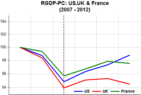
So I decided to make a per capita RGDP comparison among a small set of significant economies: US, UK, France & Germany both in the 1929-39 and 2007-12 periods. “These are their stories” (Note: within each period the scales are the same):

Tragedies_2

In the “Great Depression” the US tumbled much more than the others. Britain was the first to leave the gold standard (1931)(color-coded dashed bars) and recovered sooner. France only left the GS in 1936. The US in 1933 but had a recession within the depression in 1937-38 courtesy of the Fed and Treasury misguided policies.

What about Germany? Hitler comes to power in January 1933 and almost immediately begins the war build-up. It has the strongest recovery.

Tragedies_3

Flash-forward to 2007-12. This time around Britain does worse. After seeing real incomes fall more than in France, monetary freedom in the US allows a comeback and avoids a recession within the “Great Recession” that befalls the UK and France. But all in all, a pretty lame performance:

Tragedies_4

What about Germany, ‘leader of the euro zone pack’ where many countries are ‘under water’?

Tragedies_5

How can that be? While others are now ‘diving’, it has only registered a slowdown. This is additional evidence that policy, in particular monetary policy,  has been effectively geared to German needs. And we know that Germany imposes its fiscal policy on the ‘others’.

So it´s a mystery why a ‘free country’ like Poland would wish to join!

Tragedies_6Note that Poland has it´s own scale! One has to wonder if leaders over there have a “suicide-wish”!

Update: A good related piece from Matt O´Brien:

History doesn’t need to repeat, or even rhyme. Europe doesn’t have to keep crucifying itself on a cross of euros, the gold standard of the 21st-century. The euro’s northern bloc could decide to let the ECB do more. Or it could decide to start spending more. Or not. Eurocrats seem content to do just enough to keep everything from falling apart, and nothing more. It’s one part inflationphobia, and another part strategy. Indeed, it’s how they try to keep the pressure on the southern bloc to push through unpopular labor market reforms. But doing enough today eventually won’t be enough tomorrow if the southern bloc doesn’t have any hope of recovering within the euro. The politics will turn against the common currency long before that.

By that point, Europe won’t need an acronym anymore.

Don´t wrap your product in ‘inflation paper’

I found the title of this essay by Bloomberg editors: “Toward a New Consensus on Monetary Policypromising. But then I got dizzy with the number of times the “I” word is mentioned: a total of 46 times! And it even gets to be a heading title: “Inflation Remedy”:

If the Fed announced its intention to close that gap as quickly as it could, it would be telling the financial markets to expect both a huge monetary stimulus and a rise in inflation well in excess of the Fed’s “price stability” benchmark of 2 percent. The jump in inflation would cut real short-term interest rates and stimulate demand. It wouldn’t be an unwanted side-effect. It would be part of the remedy.

It would seem natural, if what you want is to form a new consensus on monetary policy that you start out by redefining its “target”. Abolish the word inflation and substitute it for NGDP (or nominal spending). Even then, it wouldn´t be easy, given how ingrained the “I” word is in the minds of even those that should know better. For example:

The idea remains controversial — and in fact it’s an old controversy. As Charles Goodhart, one of the U.K.’s leading monetary economists, recently wrote, “Adopting a nominal income (NGDP) target is viewed as innovative only by those unfamiliar with the debate on the design of monetary policy of the past few decades.” He continued: “A NGDP target would be perceived as a thinly disguised way of aiming for higher inflation. As such, it would unloose the anchor to inflation expectations, which could raise, not lower, interest rates by elevating uncertainty about the central bank’s reaction function.”

Another ‘well-meaning’ paper just released by the Fed of New York – Lift inflation expectations to boost growth – is also hooked on the “I” word:

In times like these, a rise in inflation expectations could do the economy some good, argues research published by the Federal Reserve Bank of New York.

The paper argues that when traditional forms of monetary policy, such as cutting short-term interest rates, can go no further, central bankers can goose economic activity higher if they can convince the public the future pace of inflation is likely to rise.

Market Monetarists have a much more palatable recommendation: “Lift NGDP expectations”.

Contrary to Goodhart’s´ view that it´s a “thinly disguised way of aiming for higher inflation”, it is very explicitly focused on getting the real economy going.

Apparently, the Volcker Fed thought so too. At the end of 1982 the following exchange took place at the FOMC meeting:

Frank Morris (Boston Fed president): “I think we need a proxy – an independent intermediate target – for NGDP, or the closest thing we can come to as a proxy for NGDP, because that´s what the name of the game is supposed to be.”

The chart shows what happened thereafter. Initially NGDP growth shot up to over 12%, positioning spending at a new level before being ‘eased down’ to the 5% plus that characterized the growth path of NGDP during the “Great Moderation”. Inflation continued to trend down and unemployment dropped from lofty heights.

New wrap_1

The next chart shows what happened when the FOMC adopted ‘forward guidance’ in mid-2003 after observing that ‘extremely low’ interest rates were not doing the job of igniting the economy. NGDP growth jumped to bring the level of spending to the original path. Unemployment came down and inflation went back closer to “target”. Please note that during 2003-05 there was an oil and commodity price shock! Having brought back spending to the level target path, NGDP growth eased back to the 5% plus rate.

New wrap_2

Unfortunately Bernanke, ‘hooked-up’ on the “I” word, was instrumental in bringing about the “Great Recession”. And keeping the “I” word alive will not help in changing the economic landscape.

Market monetarists, with their single-minded focus on the level of aggregate nominal spending provide a much more effective solution.

HT David Levey

NGDP & NGDI: “Take II”

In his post Scott Sumner writes:

Don’t believe the headline 1.4% rise in Q4 NGDP.  The actual rate of increase was 3.6%, or 2.6% in real terms.  You want to always use the NGDI estimate of NGDP, which is more accurate than the NGDP estimate of NGDP.   Of course the job growth in Q4 was consistent with a 2.6% RGDP number, and wildly inconsistent with 0.4% RGDP growth.

I´m not fixated on differences between the two. In the end they have to provide the same information (an accounting identity: Y=E). A while ago I did a tongue in cheek post: NGDP & NGDI: Two sides of the ledger and playing “catch-up”.

One problem with the NGDI measure of NGDP is that it is only released with the final revision (3rd) of the NGDP measure of NGDP. But even leaving that aside, I think the NGDP measure of NGDP is at least as good as the NGDI measure of NGDP.

I´ll illustrate with a few charts. Scott says that “Of course the job growth in Q4 was consistent with a 2.6% RGDP number, and wildly inconsistent with 0.4% RGDP growth”. Those growth rates are annualized growth rates, so quite volatile. In fact NGDI growth is more volatile than NGDP growth, both on the basis of year on year growth and annualized growth (naturally, the means are the same).

The chart shows annualized employment growth and NGDP and NGDI annualized growth. Note how NGDI growth wiggles about more ‘wildly’ than NGDP growth. Note also how much less volatile is annualized employment growth.

An important point to note is that employment, as is well known, is a lagging indicator. This can most clearly be seen following the trough of the Great Recession. Employment turns 1 quarter after NGDP/NGDI. Therefore, employment growth is more likely to be consistent with spending and real growth in the previous quarter than with contemporaneous growth. And in Q3 NGDP annualized growth was a ‘solid’ 5.9% (4.3% for NGDI).

NGDPDI-2_1

The next chart narrows the period and shows annualized employment and RGDP growth. The lagging nature of employment stands out. Note that in Q3 2012 RGDP growth clocked 3.1%. Given that it dropped to 0.4% in Q4, maybe employment growth in Q1 2013 will be a little lower than the average of 1.6% obtained in the last couple of years (also the rate observed in Q4 2012).

NGDPDI-2_2

A very negative view of a solution to the EZ troubles being found

This post argues that “Rich Germany” is already questioning it´s transfers to “poor Germany”. What about transfers to “poor others”?:

If I asked you how the structural problems of the Eurozone may be resolved, I am sure that the suggestion of a fiscal union in which transfer payments will be made by the “rich” Northern member states to the “poor” ones in the South of Europe would rank amongst the top answers. I’ve been wondering for a while if the member states could ever agree upon major fiscal transfer payments and if it would indeed lead to greater degree of convergence within the Eurozone. I feel that we have come closer to an answer to my questions this week. And I am not referring to the issues around Cyprus.

Yesterday the German federal states Hesse and Bavaria filed a lawsuit against the existing mechanism of fiscal transfer between the federal states of Germany, the so-called “Länderfinanzausgleich”. The German constitution states that the objective of this fiscal transfer mechanism is the convergence of the financial power across its federal states. The current system consists of vertical payments between the German state (“Bund”) and the federal states (“Länder”) as well as horizontal payments from federal state to federal state. The eligibility for transfer payment receipts is determined by an index (“Finanzkraftmesszahl”) which indicates the relative financial power of the federal states. Bavaria, Baden-Württemberg and Hesse are currently the only net contributors, while Berlin is the biggest net recipient of these fiscal transfers.

Bavaria and Hesse argue that the current mechanism does not create any incentives for the net recipients to improve their financial position. It is said that sanctions for fiscal mismanagement are missing, while the net contributors are discouraged to consolidate their finances further as long as they have to redistribute their wealth. Basically, one rich German state is arguing why it should transfer its fiscal revenues to a poor (and arguably irresponsible) German federal state. If you already see significant opposition against a redistribution mechanism of wealth within a country, how is it possible to picture Germany, the Netherlands or Finland agreeing on major fiscal transfer payments to Southern Europe?

Both fail, but the ECB failure hurts more!

Ryan Avent has this post “The biggest problem” in which, comparatively, the Fed ‘looks good’.

He puts up a comparative NGDP growth chart:

ECB-Fed_1

And writes:

The red line shows year-on-year growth in the euro zone’s nominal output or, if you like, how much more money, in euro terms, is being spent across the euro area relative to the year prior. The blue line shows the same number, in dollar terms, for the American economy. The large divergence at the end corresponds to the large divergence in the performance of real growth and unemployment.

Now a dip in nominal growth will often result from a real factor. But a sustained decline in nominal growth is the central bank’s fault. It can’t prevent a drop in the productive potential of an economy (thanks to, say, the mysterious loss of its long-time offshore banking centre). But it can prevent a drop in the productive potential of an economy from translating into a drop in spending in the economy: it just has to pump in more money.

Nothing wrong with the argument that it´s “the central bank´s fault”. But I don´t want people to have the impression that the Fed did a much better job. Both did a lousy job, as seen by the similar nominal spending gap in both places. The ECB went nuts in early 2011 when it raised rates. Although it was later reversed it was effectively “too late to say you´re sorry”. After that ‘bold move’ by the ECB the EZ NGDP gap widened more significantly (in certain countries this proved to be ‘deadly’) . In the US, on the contrary, the Fed talk continued to be about monetary stimulation (QE3, thresholds, security purchases, etc.), so the speed of the fall dropped. That´s why the growth graph presented by RA shows the NGDP growth divergence in the two areas for the past couple of years.

ECB-Fed_2

But note that NGDP growth in the US is still far below what´s necessary to get spending back to any reasonable trend level path!

Scott´s Quiz Illustrated

The answers:

1.  The eyeball test suggests the Quantity Theory of Money (QTM) works dramatically better for high inflation countries than low inflation countries.  (Also true of PPP and the Fisher effect, for much the same reason.)  In fact, money growth affects prices in all countries, but other factors are relatively more important when inflation is low.  Let’s suppose that the gap between money growth and inflation does not vary with the average rate of money growth.  For instance, suppose the gap is 3% on average, when examining very long run data.  In that cases the gap will seem almost trivial when money growth rates become very large, say more than 30%/year.

If you see the QTM as claiming money growth and inflation rates are highly correlated, then the theory works better for high inflation countries.  If you view it as it claiming that a given one time increase in the money supply will cause a proportionate increase in prices in the long run, then it should work equally well in low and high inflation countries.  Indeed even at the zero interest rate bound.

2.  In the vast majority of countries the money growth rate exceeded the inflation rate.  That means the money demand curve tends to shift to the right over time, at least when you describe money demand as a function of the value of money (1/P).  Many people prefer to visualize this pattern with the Equation of Exchange:  M*V = P*Y.  If V is fairly stable, and Y increases over time, then inflation will be less than money growth.  RGDP growth is deflationary!!  (Something our textbooks ignore—and check out Singapore below.)  In Barro’s sample of 83 countries, only one experienced falling RGDP on average over the entire 30 year period.

3.  Why does the money growth/inflation gap exceed 10% in only one of the 83 cases?  Partly because RGDP growth averages less than 10% in all 83 countries.  But it also requires velocity to be relatively stable.  Keep in mind that a 30% change in velocity over 30 years is fairly large, and yet is still less than 1% per year on average.  For money growth to exceed inflation by more than 10% you need the RGDP growth rate minus the change in velocity to exceed 10%, which occurred only in Libya.

4 and 5.  In order for the inflation rate to exceed the money supply growth rate you’d need the change in velocity to exceed the RGDP growth rate.  That would be a fairly large increase in velocity, and occurred in only 12 of the 83 countries.  The vast majority of these situations occurred in the high inflation countries.  (Seven of twelve in the 13 highest inflation countries.)  This is because velocity is positively correlated with nominal interest rates.  For velocity to rise sharply you normally need a large increase in interest rates, which usually implies a large increase in inflation (or more precisely NGDP growth) expectations. Unfortunately the table doesn’t show the change in inflation expectations. However it stands to reason that a very large increase in inflation expectations is more likely to occur in countries where the average rate of inflation is higher, and that’s what we observe.

Below the answers illustrated. The data set is also from Barro (Macroeconomics – A modern approach (2008)) and differs somewhat from his previous data set. It covers, for most of the 82 (Libya is not included) countries, the 40 years between 1960-2000.

Q1. The high inflation countries are closer to the regression line. Money growth ‘dwarfs’ RGDP growth.

Scott Quizz_1

Q2/Q3/Q4/Q5. High RGDP growth countries tend to have a larger difference between money growth and inflation. Additionally, in countries such as Korea and Singapore, velocity decreased substantially. In very high inflation countries money becomes a “burning potato” and slow RGDP growth only makes it “hotter” i.e., velocity ‘rockets’ so that inflation is higher than money growth. Although it was the inflation ‘silver medalist’ Brazil, more than any other high inflation country, developed efficient ‘living with inflation’ mechanisms.

Scott Quizz_2

The last chart shows what happens when you move quickly (and credibly) from a high (and rising) inflation environment to a low inflation environment. This happened in Brazil in mid-1994. Before 1994 velocity was rising (Money/NGDP falling). From that point on, money growth was significant but not inflationary because it was compatible with the increase in money demand (fall in velocity) that accompanied the steep drop in inflation (and nominal interest rates).

Scott Quizz_3


Update: The following chart is basically consistent with the long-run neutrality of money. In the long run money growth only affects nominal variables (like inflation) having no effect (maybe slightly negative due to the inneficiences brought about by very high inflation) on real variables (like RGDP growth).

Scott Quizz_4

Bubbles & Volatility

In the comment section of this post by Scott Sumner, I came across an interesting exchange between TravisV and Scott:

TravisV

Prof. Sumner,

At the AEI event with Avent and Pethokoukis, you suggested as an aside that there is an association between volatile NGDP and asset price bubbles. Could you please clarify that reasoning? I don’t see the connection, given that NGDP was very volatile during the 1970′s and there weren’t any major asset price bubbles.

TravisV. In both the early 1930s and late 2008 NGDP was very volatile, and asset prices were extremely volatile. A “bubble” is really nothing more than extremely volatile asset prices over a frequency of years.

TravisV replies:

Alright, I guess I need more help with Prof. Sumner’s “volatile NGDP encourages asset price bubbles” theory.

NGDP was volatile in the 1970′s but there were no major asset bubbles then. Seems like major contrary evidence to me.

Below I repeat my previous chart on NGDP volatility ‘through the ages’ and below I add the corresponding chart for the S&P 500 volatility.

Genie_1

Genie_4

There are two occasions where there are a few points significantly outside the volatility ‘boundary’ for the S&P. During 1979-86, on the ‘up direction’ and in the early stages of the “Great Recession” in the ‘down direction’.

The takeaway is that there seems to be no association between NGDP volatility and asset (stock) price volatility. And given that the volatility of the S&P was mostly within the ‘boundary’ over the whole period, either there was no stock price bubble or a bubble has no connection with volatility.

Inflation Expectations Diverge

Every month with the release CPI release I do an ‘inflation day post’. This month I missed out on the coverage of the Cleveland Fed inflation expectations curve, but better late than never!

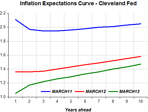
The charts show that inflation expectations year after year have been going down for all maturities. That remains true comparing last month´s to this month´s curve. I would have thought that the greater optimism that lately has pervaded comments and analysis and that is reflected in stock market behavior, for example, would have ‘bumped up’ inflation expectations. Apparently not.

Infla Exp Divergence_1


Infla Exp Divergence_2

So I decided to compare the Cleveland Fed inflation expectations (5 & 10 years) to the 5 and 10 year TIPS spread. This is what transpired.

Infla Exp Divergence_3

The TIPS spread measure of inflation expectations is much more ‘sensitive’ than the Cleveland Fed´s calculation, but what I was looking for is to see if they tell the same ‘story’. Note that they both go up after QE0 at the end of 2008, when it became clear that the Fed would not let the financial system ‘go broke’. In March 09 QE1 is implemented and both measures of expectations, for the medium and long term, keep going up. They reverse trend when QE1 ends in March 10. They react positively to hints of QE2 in late August 10 but come down again after April 11 when the Fed confirmed the end of QE2 scheduled for June 11.

The divergence between the two measures of inflation expectations follows the launch of ‘Operation Twist’ in September 2011. While long term inflation expectations derived from the TIPS spread go on a rising trend that remains even now, following QE3 in September 12 (and QE3 cum thresholds in November) 10 year inflation expectations from the Cleveland Fed remain ‘flat’ and then notch down a step last May.

The divergence is not so great for the medium term measure of inflation expectations, but it is still visible in the data.

Operation Twist´s purpose was to affect the term structure of rates, hopefully lowering longer term rates. Maybe the divergence reflects technical aspects of the Cleveland Fed measure impacted by the policy. For those with a technical bent the Cleveland Fed methodology  is described here.

Or maybe it´s something else. Any ideas?

“Genie in a bottle”

Maybe like others, I was surprised by Larry Kudlow´s nice reference to market monetarism. But what drew my attention was the mid part here:

Interestingly, while the inflation rate has remained subdued, so have market-price indicators, such as gold, the dollar, and commodity indexes. The suggestion here is that Bernanke, rather than mounting a high-inflation policy, has been avoiding deflation.

At the end of the day, the Federal Reserve is not the engine of growth. Low tax rates, light regulation, and limited government spending create the incentives for more rapid economic expansion and prosperity-inducing opportunities.

But if I have this story right, the market monetarists want the central bank to enforce a nominal GDP growth rule, which will avoid both deflation and inflation, and thus give fiscal incentives breathing room for a more rapid job-creating expansion.

Many think MM´s propose the Fed be the “engine of growth”. Big mistake. What we propose, with NGDP level targeting, is that the Fed embraces its role as the “engine of nominal stability” (“avoid both inflation and deflation”).

The “Great Moderation” is our “show case” period. As the panels indicate pretty clearly – by correlating NGDP growth in period t with NGDP growth in period t+1 (and the same for real GDP growth and PCE-Core inflation) – is that during the period the Fed managed to keep “the genie (NGDP) inside the bottle” i.e. attain NOMINAL STABILITY, real stability AND low and stable inflation followed suit.

Genie_1

Genie_2

Genie_3

It is interesting to note, indicating that targeting inflation successfully is not enough, is that while Bernanke has managed (imperfectly) to keep inflation low, by losing nominal stability he also lost real output stability (and keeps being afraid of sliding into deflation).

Update: The NK trade-off is not between inflation and real output (employment/unemployment) as in the original Phillips Curve, but between real output variability and inflation variability. This trade-off is determined by the choice of parameters (for the deviation of inflation from target and output from potential) in the Monetary Policy Rule. Market Monetarists argue that by stabilizing nominal output (NGDP) you “minimize” the variability of both real output and inflation. The “Great Moderation”, characterized by NGDP stability along a level path, provides compelling evidence.

Lowered standards

This post by Tim Duy is really a testament to how far standards have been lowered or, you could say, how content some are with the “new normal”. In “The recovery is here to stay”, TD starts off:

 A lot of ink has been spilled over the past three years fretting about the fragility of the economy.  But the reality is largely the opposite.  The economy has proved to be very resilient.  We have weathered external demand shocks, external financial crises, and even fiscal contraction, and all the while economic activity continued to grind higher.  Looking back, it seems that the biggest risk the economy faced was the Fed’s start/stop approach to quantitative easing.  That problem appears solved with open-ended QE linked to economic guideposts.

At the risk of sounding overly optimistic, I am going to go out on a limb:  The recovery is here to stay.  Not “stay” as in “permanent.”  I am not predicting the end of the business cycle.  But “stay” until some point after the Federal Reserve begins to raise interest rates, which I don’t expect until 2015. This doesn’t mean you need to be happy about the pace of growth.  But it does mean that a US recession in the next three years should be pretty far down on your list of concerns.

It´s less than three months to four years, not just three years! And I don´t understand very well his “…the biggest risk the economy faced…”, because it was the QE´s. even if badly conceived, that got the economy going even if at a rate far short of what was required.  TD then goes on to show several pictures of the landscape; industrial production, retail sales, among others. Never mind those because they all mimic the shape of aggregate nominal spending (NGDP) as pictured further down this post.

TD writes on:

As long as the Fed is able and willing to ease in the face of negative shocks – and they have seemed to be willing to do so and have  found a solution to the zero bound problem in quantitative easing – I would expect that monetary policy would largely offset most problems that comes down the pipeline.  

Case is point is the Asian Financial Crisis.  I remember predictions of US recession due to the trade shock, but that never occurred.  The Fed eased into the crisis, mitigating its impact.  The recession only occurred after the Fed revered course and tightened sufficiently to invert the yield curve.  Arguably last summer’s European shock was the same.  The Fed met fire with fire, and recession fears faded.

Hear that? The Fed is really a ‘shock offsetting machine’! Only sometimes, or under some leadership, it ‘offsets fully’ but does  so only ‘partially’ (and belatedly) at other times, or under ‘new management’. The charts illustrate:

Lowered Standards

Although he says the “recovery is real” he has some qualms:

Mostly now I concern myself with the pace of growth (still disappointing) and the eventual policy reversal.  Similar to Ryan Avent here, I am not convinced that the Fed will be successful in pulling the economy off the zero bound.

And then:

Bottom Line:  The US economy is less fragile than commonly believed; it has endured a series of shocks over the last three years without major incident.   I am claiming neither that equity prices won’t stumble, nor that we should be happy with the pace of activity.  But I do think that a recession is unlikely before the Federal Reserve begins raising interest rates – something not likely to happen for two years.  While long-run predictions are dangerous, for the sake of argument add up to another two years for tighter policy to reverberate through the economy and you are looking at sometime around 2016/2017 when the next recession hits.  That’s the timeframe I am currently thinking about.

Remember that the longest expansion on record was 10 years (1991-01), the second longest was 8 years and 8 months (1961-69) and the third was 7 years and 7 months (1982 – 91). Note that the first and third longest took place during the “Great Moderation” and the second longest during the last half of the “Golden Age”. So saying that this expansion is likely to go on for 7 or 8 years at the same time that it´s unlikely the Fed will be able to pull the economy off the ZLB is a tad optimistic! And even if it goes on for that long there will still be a sizeable gap relatively to what could or should have been!